Table of Contents (Start)
- Topics
- Introducing SevOne
- Login
- Startup Wizard
- Dashboard
- Global Search - Advanced Search
- Report Manager
- Report Attachment Wizard
- Report Properties
- Report Interactions
- Instant Graphs
- TopN Reports
- Alerts
- Alert Archives
- Alert Summary
- Instant Status
- Status Map Manager
- Edit Maps
- View Maps
- FlowFalcon Reports
- NBAR Reports
- Logged Traps
- Unknown Traps
- Trap Event Editor
- Trap Destinations
- Trap Destination Associations
- Policy Browser
- Create and Edit Policies
- Webhook Definition Manager
- Threshold Browser
- Create and Edit Thresholds
- Probe Manager
- Discovery Manager
- Device Manager
- New Device
- Edit Device
- Object Manager
- High Frequency Poller
- Device Summary
- Device Mover
- Device Groups
- Object Groups
- Object Summary
- Object Rules
- VMware Browser
- AWS Plugin
- Azure Plugin (Public Preview)
- Calculation Plugin
- Database Manager
- Deferred Data Plugin
- DNS Plugin
- HTTP Plugin
- ICMP Plugin
- IP SLA Plugin
- JMX Plugin
- NAM
- NBAR Plugin
- Portshaker Plugin
- Process Plugin
- Proxy Ping Plugin
- SDWAN Plugin
- SNMP Plugin
- VMware Plugin
- Web Status Plugin
- WMI Plugin
- xStats Plugin
- Indicator Type Maps
- Device Types
- Object Types
- Object Subtype Manager
- Calculation Editor
- xStats Source Manager
- User Role Manager
- User Manager
- Session Manager
- Authentication Settings
- Preferences
- Cluster Manager
- Maintenance Windows
- Processes and Logs
- Metadata Schema
- Baseline Manager
- FlowFalcon View Editor
- Map Flow Objects
- FlowFalcon Views
- Flow Rules
- Flow Interface Manager
- MPLS Flow Mapping
- Network Segment Manager
- Flow Protocols and Services
- xStats Log Viewer
- SNMP Walk
- SNMP OID Browser
- MIB Manager
- Work Hours
- Administrative Messages
- Enable Flow Technologies
- Enable JMX
- Enable NBAR
- Enable SNMP
- Enable Web Status
- Enable WMI
- IP SLA
- SNMP
- SevOne Data Publisher
- Quality of Service
- Perl Regular Expressions
- Trap Revisions
- Integrate SevOne NMS With Other Applications
- Email Tips and Tricks
- SevOne NMS PHP Statistics
- SevOne NMS Usage Statistics
- Glossary and Concepts
- Map Flow Devices
- Trap v3 Receiver
- Guides
- Quick Start Guides
- AWS Quick Start Guide
- Azure Quick Start Guide (Public Preview)
- Data Miner Quick Start Guide
- Flow Quick Start Guide
- Group Aggregated Indicators Quick Start Guide
- IP SLA Quick Start Guide
- JMX Quick Start Guide
- Metadata Quick Start Guide
- RESTful API Quick Start Guide
- Self-monitoring Quick Start Guide
- SevOne NMS Admin Notifications Quick Start Guide
- SNMP Quick Start Guide
- Synthetic Indicator Types Quick Start Guide
- Topology Quick Start Guide
- VMware Quick Start Guide
- Web Status Quick Start Guide
- WMI Quick Start Guide
- xStats Quick Start Guide
- xStats Adapter - Accedian Vision EMS (TM) Quick Start Guide
- Deployment Guides
- Automated Build / Rebuild (Customer) Instructions
- Generate a Self-Signed Certificate or a Certificate Signing Request
- SevOne Best Practices Guide - Cluster, Peer, and HSA
- SevOne Data Platform Security Guide
- SevOne NMS Implementation Guide
- SevOne NMS Installation Guide - Virtual Appliance
- SevOne NMS Advanced Network Configuration Guide
- SevOne NMS Installation Guide
- SevOne NMS Port Number Requirements Guide
- SevOne NMS Upgrade Process Guide
- SevOne Physical Appliance Pre-Build BIOS and RAID Configuration Guide
- SevOne SAML Single Sign-On Setup Guide
- Cloud Platforms
- Other Guides
- Quick Start Guides
Instant Graphs
Instant Graphs enable you to create statistical graphs for the objects and indicators on devices.
To access the Instant Graphs page from the navigation bar, click the Reports menu and select Instant Graphs.
The Welcome Dashboard also provides access when you click the Create Graphs link in the Utilize Reporting Tools section.
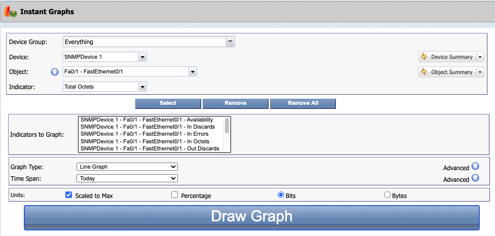
Instant Graph Report Settings
You can graph any number of indicators from any number of different devices and interfaces in the same graph.
-
Click the Device Group drop-down and select a device group/device type.
-
Click the Device drop-down and select a device from the list of devices that are members of the device group/device type you select.
-
Click Device Summary to display the Device Summary. Click
 to select from a list of report templates that are applicable for the device.
 -
Click
 and select the Show Hidden check box to include hidden objects in the Object selection list for the following step.
 -
Click the Object drop-down and select an object from the list of objects polled on the device you select.
-
Click Object Summary to display the Object Summary. Click
to select from a list of report templates that are applicable for the object. -
Click the Indicator drop-down and select an indicator to graph. HC stands for High Counter which is a 64 bit counter on an indicator that increments rapidly.
-
Click the Select button below the Indicator drop-down field to move the indicator to the Indicators to Graph field.
-
Repeat the previous steps to add additional indicators to the Indicators to Graph field.
-
Click the Graph Type drop-down.
-
Select Bar Graph to display a graph of qualitative independent variables such as when you need to compare the in octets of two or more routers.
-
Select CSV to export the data as comma delimited values in a text file format that you can import into a spreadsheet application. This option uses a UNIX time stamp to enable further data manipulation.
-
Select CSV - Readable Times to export the data as comma delimited values that use human-readable date and time representations instead of UNIX time stamps.
-
Select Line Graph to display a graph that overlays all indicators and each indicator has its own line. Line graphs can display trends and display past data as an additional line on the graph.
-
Select Pie Graph to display the data as a pie graph. Pie graphs are useful for percent reports such as when you need to graph the available hard drive space on a device.
-
Select Stacked Bar Graph to display each graph bar stacked above the prior graph bar to better visualize how values compare as a whole.
-
Select Stacked Line Graph to display each graph line stacked above the prior graph line to visualize how values compare as a whole. Stacked line graphs extract the poll points that occur at different times and calculate averages to plot the data points on the graph as though they occur at the same time. Stacked line graphs take slices of poll points and aggregate the points into an average, so spikes appear smaller than in a line graph because line graphs do not use aggregation.
-
Select Display Maintenance Windows to include a transparent gray background in the graph indicating the time of day any device is in one or more maintenance windows.
-
-
Click the
Advanced button to the right of the Graph Type drop-down to create a graph that uses the advanced options for trends and scaling.
-
In the Graph a Trend section, select one of the following options. (Line graph only.)
Trend calculations use the following variables:
-
beginTime - The time you specify, where the actual polled data for the graph begins.
-
endTime - The time you specify, where the actual polled data for the graph ends.
-
trendStartTime - The time from which SevOne NMS begins to consider the data to use to calculate the graph trend line.
-
projectedTime - The time you specify, that SevOne NMS uses to project future data until for the graph trend line.
-
Select None to disable trending.
-
Select Historical Trend to trend data six times back in history.
ExampleIf you create a graph that spans a 24-hour time period with historical trending, the previous 5 days' of data is also processed to calculate the trend line.
CalculationtrendStartTime = beginTime - 5 * (endTime - beginTime) -
Select Standard Trend to trend the data for the time span you define.
-
Select Number of Days to Project a Trend to project the trend into the future by calculating a historical trend. If you select this option, enter the number of days in the text field.
ExampleTo graph data from midnight on January 1, 2016 until midnight on January 11, 2016 and to project what the data might look like at this rate until midnight on January 16, 2016. The difference between the time to project data until and the time that the graph data ends is 5 days (Jan 16 - Jan 11). Since the difference in time between the projectedTime (Jan 16) and the endTime (Jan 11) is 5 days, SevOne NMS processes all data since 25 days (5 * 5 days) before midnight of January 11, 2016 to calculate the trend line.
CalculationtrendStartTime = endTime - 5 * (projectedTime - endTime)
-
-
If you select a Graph a Trend option other than None, click the Type drop-down.
Calculations use the following variables:
-
y - Trend line
-
x – Time
-
A – The coefficient of determination, or R2 value
-
M - The slope of the line
-
B - The y intercept of the line
-
E – Euler's constant (e = 2.71828)
-
Select Linear to display a linear trend line. Data is linear if the pattern resembles a line. A linear trend line typically shows that something is increases or decreases at a steady rate.
ExampleThe consistent rise of refrigerator sales over a 13 year period.
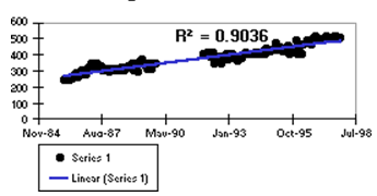 Calculation
y = B + M * x -
Select Exponential to display a curved trend line that for data values that rise or fall at increasingly higher rates. You cannot create an exponential trend line for data that contains zero or negative values.
ExampleThe decreasing amount of carbon 14 in an object as it ages.
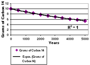 Calculation
y = B * e^(A * x)Only y values where y ≥ 1 are considered. Any other y values are ignored.
-
Select Logarithmic to display a logarithmic trend line for a curved line that is most useful when the rate of change in the data increases or decreases quickly and then levels out. A logarithmic trend line can use negative and/or positive values.
ExampleThe predicted population growth of animals in a fixed space area, where the population levels out as the space for the animals decreases.
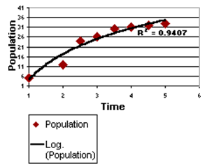 Calculation
y = B + A * 1 n (x)Only x values where x ≥ 1 are considered. Any other x values are ignored.
-
Select Power to display a curved trend line to compare measurements that increase at a specific rate. You cannot create a power trend line for data that contains zero or negative values.
ExampleThe acceleration of a race car at one second intervals by plotting distance in meters per second.
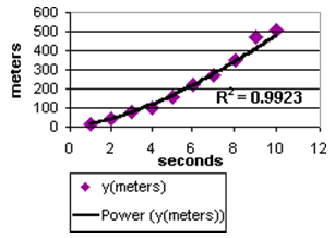 Calculation
y = B * x^AOnly x values where x ≥ 1 and y values where y ≥ 1 are considered. Any other x values or y values are ignored.
-
-
Select the Highlight: Work Hours check box to isolate the data for the hours you specify to perform calculations. This enables you to exclude non-work hour data to present a true view of the resource utilization. Data within the work hours displays in a darker shade in the graph.
-
If you select the Highlight Work Hours check box, click the Highlight: Work Hours drop-down.
-
Select System Default to include data for the work hours you designate to be the default work hours.
-
Select Custom to display a pop-up that enables you to define the work hours for the data in the graph.
-
Select Use Device Work Hours to included data for the work hours that you associate with the device on the Edit Device page.
-
Select from The work hours you define on the Work Hours page. Please refer to section Work Hours in SevOne NMS System Administration Guide for details.
-
Click the View link to view the work hour definition.
-
-
Select the Calculate <n> Percentile Line check box to evaluate the regular and sustained utilization of the indicator's data and calculate the percentage of the usage you define. If you select this check box, enter the percentage in the text field. Line graphs display an additional line on the graph and other graph types display this information in the legend.
-
Select the Show Summary Information check box to display summary information in the .csv file. (CSV and CSV Readable only.)
-
Select the following check boxes to adjust the graph display for clarity.
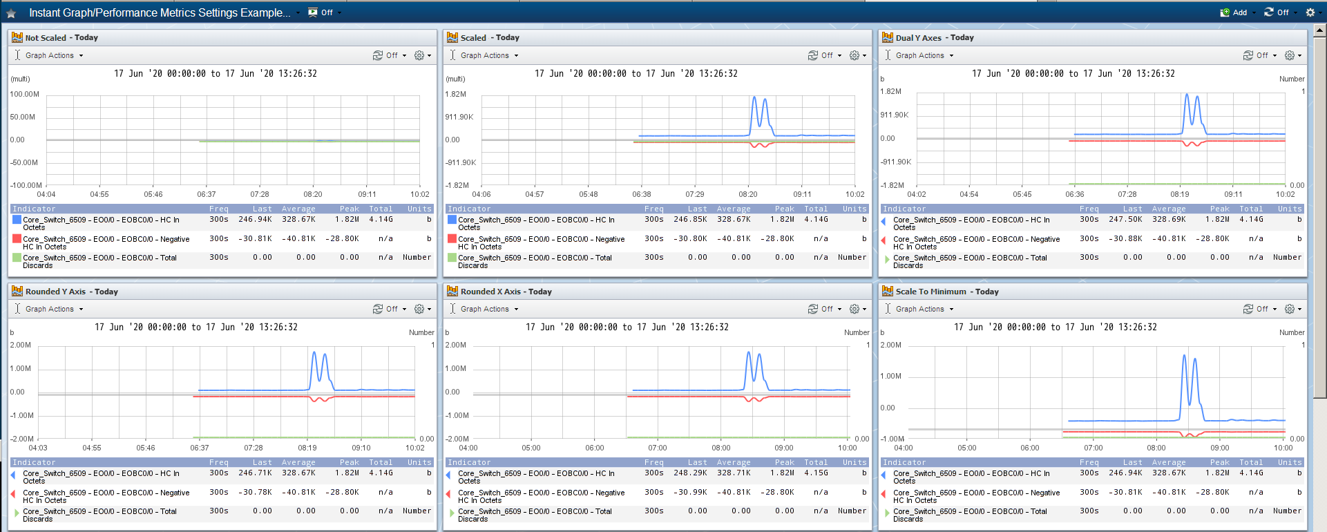
Exact Same Graph with Different Display Settings
-
Select the Scaled to Max check box (in the Units section below) to scale the graph data from zero to the largest actual value present. Leave clear to scale the graph data from zero to the maximum potential value. This check box is irrelevant for indicators that do not have a defined maximum value. (Bar, Line, Stacked Bar, and Stacked Line graphs only.)
-
Select the Dual Y Axes check box to display a Y axis on the left of the graph and a Y axis on the right of the graph. This is useful when graph results are diverse. The legend displays triangles to indicate which axis the graph item uses. (Bar and Line graph only.)
-
Select the Rounded Y Axis Values check box to round all left hand Y axis grid line values. For dual Y axes this rounds the top right hand Y axis grid line value. (Bar, Line, Stacked Bar, and Stacked Line graphs only.)
-
Select the Rounded X Axis Times check box to round the X axis grid line values. (Bar, Line, Stacked Bar, and Stacked Line graphs only.)
-
Select the Logarithmic Scaling check box to more accurately reflect data that is affected by a large spike which results in the rest of the graph appearing flat. (Line graph only.)
-
Select the Scale to Minimum Value check box to scale the graph from maximum down to the minimum actual value. Leave clear to scale the graph from maximum down to zero. (Line, Bar, and Stacked Bar graphs only.)
-
-
-
Click the Time Span drop-down.
-
Select Past 8 Hours to display data from the past eight hours.
-
Select Today to display data from 12:00am until now.
-
Select Yesterday to display data from 12:00am yesterday until 12:00am today.
-
Select Past 24 Hrs to display data from the past 24 hours.
-
Select This Week to display data from Sunday midnight until now.
-
Select Last Week to display data from Sunday midnight to Sunday midnight during the prior week.
-
Select Past Week to display data from the current time seven days ago until the current time today.
-
Select This Month to display data from midnight on the first day of the current month until now.
-
Select Last Month to display data from the first day of the last month to the last day of the last month.
-
Select Past Month to display data from the current time one month ago until the current time today.
-
Select Specify to displays additional fields to enable you to define the time span.
-
-
Click the
Advanced button to the right of the Time Span drop-down to define the following advanced time span settings. -
Select the Time Over Time check box to add a second data representation to the graph. This enables you to display data for a specified period of time in the form of a dotted line. If you select this check box, perform the following steps. (Line, Bar, CSV, and CSV Readable graphs only.)
-
Click the drop-down.
-
Select Average to create a graph where each data point is the average value per interval.
-
Select Minimum to create a graph where each data point is the minimum value for each interval.
-
Select Maximum to create a graph where each data point is the maximum value for each interval.
-
Select Total to create a graph where each data point is the total amount of data for each interval.
-
-
Enter a number for the length of the interval, then click the drop-down and select: Days, Weeks, Months, Quarters, or Years.
-
Select the Display Only Averaged Indicator check box to display only the time over timeline on the graph without any other indicator data. Leave clear to display both indicator data and time over time data.
-
-
Click the Aggregation drop-down. Data is grouped into buckets based on the time span and the interval you enter in this step. The data in each bucket is aggregated to create one data point on the graph per bucket.
ExampleSelect Past 8 Hours from the Time Span drop-down and enter 600 seconds (ten minutes) in the Interval field to create 48 buckets and 48 data points.
Each bucket contains the data for each interval. The aggregation you select here determines how to generate the data point for each bucket.
-
Select Auto to use the highest applicable frequency aggregation. Bar, Stacked Bar, and Stacked Line graphs use Auto aggregation.
-
Select Average to calculate the average of the values in each bucket (sum of all the values in the bucket divided by the number of values in the bucket) to create a graph where each data point is the average value per interval.
-
Select Minimum to find the lowest value in each bucket and create a graph where each data point is the minimum value for each interval.
-
Select Maximum to find the highest value in each bucket and create a graph where each data point is the maximum value for each interval.
-
Select Total to add all data in each bucket and create a graph where each data point is the total amount of data for each interval.
-
Select None to graph all data without aggregation. Not available for Time Over Time graphs where all data is aggregated.
-
-
Select the Baseline check box to display the baseline on the graph. (Line, Bar, CSV, and CSV Readable graphs only.)
-
If you select the Baseline check box, click the Standard Deviation drop-down and select a standard deviation to display a measure of dispersion in a frequency distribution equal to the square root of the mean of the squares of the deviations from the arithmetic mean of the distribution.
ExampleValue = 1, Baseline = 10, Standard Deviation = 2.
The calculation is: (2*Standard Deviations+Baseline)=2*2+10=14.
-
-
Select the Scaled to Max check box to scale the graph data from zero to the largest actual value present. Leave clear to scale the graph data from zero to the maximum potential value. This check box is irrelevant for indicators that do not have a defined maximum value. (Bar, Line, Stacked Bar, and Stacked Line graphs only.)
-
Select the Percentage check box to compare capacity or leave clear to compare the relative values of the different metrics.
-
Select either Bits for network oriented data or select Bytes for server oriented data.
-
Click Draw Graph to display the graph below the Draw Graph button.
Instant Graph Report Interactions
The following controls enable you to manipulate the graph presentation.
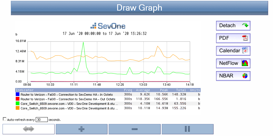
 - To re-center a graph, click this icon, and then click on the graph to where you want to center the graph.
 - To zoom in, click this icon, and then click on the graph where you want to zoom into the graph.
 - To zoom out, click this icon, and then click on the graph where you want to zoom out from the graph.
 - To select a range, click this icon, then click once at the range start point, and then click again at the range end point. The range appears highlighted. Click anywhere inside the range you highlight to view a graph for the range you highlight.
-
Select the Auto-refresh Every __ Seconds check box to refresh the graph data every <n> seconds. Enter the number of seconds in the text field.
-
Move the cursor over the graph to display a tooltip that includes additional information.
-
Click Detach to add the instant graph as an attachment in a report on a new browser tab. You can modify reports to add other attachments and you can save reports to the Report Manager. Report workflows enable you to designate reports to be your favorite reports and to define one report to appear as your custom dashboard.
-
Click PDF to export the instant graph to a .pdf format.
-
Click Calendar to view the indicator performance over time. A calendar appears in a separate window to display a line graph of the data over the period of this month. See the Navigate Calendars section below for details.
-
If an indicator in the graph has mapped flow data, click NetFlow to view associated flow data. When you enable the SNMP plugin for a device, many SNMP objects are automatically mapped to their corresponding flow interface and the Object Mapping page enables you to map additional objects for flow monitoring. For details on Object Mapping, please refer to section Map Flow Objects in SevOne NMS System Administration Guide.
-
If an indicator in the graph has mapped NBAR data, click NBAR to view associated NBAR data. You map objects for NBAR monitoring on the Object Mapping page.
Custom Logos
Custom Logos are used to customize your Instant Graphs and PDF Reports so that a customized logo appears.
For Instant Graphs
-
Image must be in PNG format, 125x33 pixels, and named sevone_graph.png.
-
Login to the Cluster Leader via Command Line Interface (CLI).
$sshroot@<SevOne NMS Cluster Leader Appliance> -
Go to directory /www/htdocs/images.
$cd/www/htdocs/images -
Backup current image file for Report Logo, sevone_graph.png.
$cpsevone_graph.png sevone_graph.png.bak -
Now, copy your customized logo as sevone_graph.png.
$cp<your customized logo>.png sevone_graph.pngThe steps above also apply to other logos. Here are a few examples.
Login Screen
Location
/www/htdocs/images/sevone_rgb_web.png
Width
218px
Height
39px
Format
PNG
Menu Bar
Location
/www/htdocs/images/menubar_logo.png
Width
127px
Height
32px
Format
PNG
Report Logo
Location
/www/htdocs/images/sevone_graph.png
Width
125px
Height
33px
Format
PNG
For PDF Reports
with WebKit disabled
-
For PDF Reports, your logo must be 810x141 pixels and named logo.jpg.
-
Login to the Cluster Leader via Command Line Interface (CLI).
$sshroot@<SevOne NMS Cluster Leader Appliance> -
Go to directory /www/htdocs/doms/images.
$cd/www/htdocs/doms/images -
Backup current image file for the PDF Reports, logo.jpg.
$cplogo.jpg logo.jpg.bak -
Now, copy your customized logo as logo.jpg.
$cp<your customized logo>.jpg logo.jpg
PDF Reports (with WebKit Disabled)
Location
/www/htdocs/doms/images/logo.jpg
Width
810px
Height
141px
Format
JPG
with WebKit enabled
-
For PDF Reports, your logo must be 400x77 pixels and named sevonelogo.png.
-
Login to the Cluster Leader via Command Line Interface (CLI).
$sshroot@<SevOne NMS Cluster Leader Appliance> -
Go to directory /www/htdocs/doms/images.
$cd/www/htdocs/doms/images -
Backup current image file for the PDF Reports, sevonelogo.png.
$cpsevonelogo.png sevonelogo.png.bak -
Now, copy your customized logo as sevonelogo.png.
$cp<your customized logo>.png logo.png
PDF Reports (with WebKit Enabled)
Location
/www/htdocs/images/sevonelogo.png
Width
400px
Height
77px
Format
PNG
Enable/Disable feature using WebKitFrom the navigation bar, click the Administration menu and select Cluster Manager. Click
 Cluster
in the cluster hierarchy on the left and select the
Cluster Settings
tab. Subtabs appear along the left side of the Cluster Settings tab to enable you to define cluster level settings. Click on General subtab. Use WebKit to PDF (Beta) field is available to allow you to enable or disable the feature using WebKit.
Cluster
in the cluster hierarchy on the left and select the
Cluster Settings
tab. Subtabs appear along the left side of the Cluster Settings tab to enable you to define cluster level settings. Click on General subtab. Use WebKit to PDF (Beta) field is available to allow you to enable or disable the feature using WebKit.
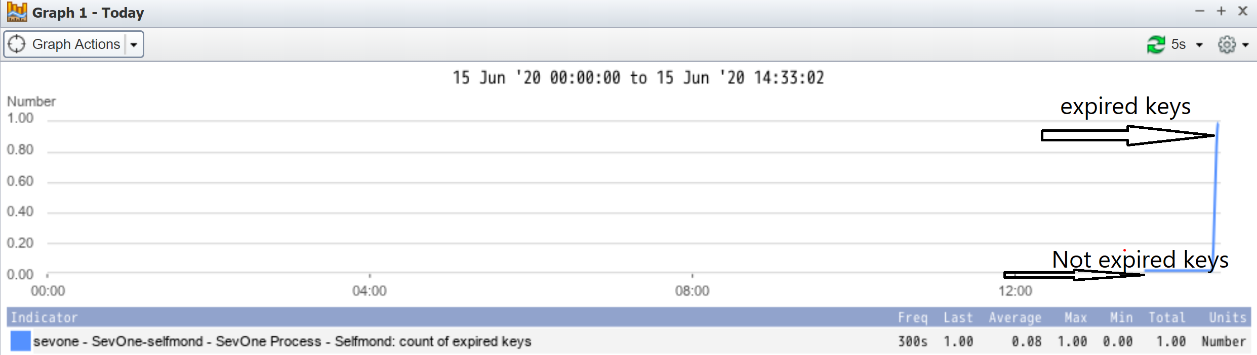
Installing selfmon with valid keys shows the key indicators that are not expired as 0 and the expired ones as 1 on the graph.
Example