Table of Contents (Start)
- Topics
- Introducing SevOne
- Login
- Startup Wizard
- Dashboard
- Global Search - Advanced Search
- Report Manager
- Report Attachment Wizard
- Report Properties
- Report Interactions
- Instant Graphs
- TopN Reports
- Alerts
- Alert Archives
- Alert Summary
- Instant Status
- Status Map Manager
- Edit Maps
- View Maps
- FlowFalcon Reports
- NBAR Reports
- Logged Traps
- Unknown Traps
- Trap Event Editor
- Trap Destinations
- Trap Destination Associations
- Policy Browser
- Create and Edit Policies
- Webhook Definition Manager
- Threshold Browser
- Create and Edit Thresholds
- Probe Manager
- Discovery Manager
- Device Manager
- New Device
- Edit Device
- Object Manager
- High Frequency Poller
- Device Summary
- Device Mover
- Device Groups
- Object Groups
- Object Summary
- Object Rules
- VMware Browser
- AWS Plugin
- Azure Plugin (Public Preview)
- Calculation Plugin
- Database Manager
- Deferred Data Plugin
- DNS Plugin
- HTTP Plugin
- ICMP Plugin
- IP SLA Plugin
- JMX Plugin
- NAM
- NBAR Plugin
- Portshaker Plugin
- Process Plugin
- Proxy Ping Plugin
- SDWAN Plugin
- SNMP Plugin
- VMware Plugin
- Web Status Plugin
- WMI Plugin
- xStats Plugin
- Indicator Type Maps
- Device Types
- Object Types
- Object Subtype Manager
- Calculation Editor
- xStats Source Manager
- User Role Manager
- User Manager
- Session Manager
- Authentication Settings
- Preferences
- Cluster Manager
- Maintenance Windows
- Processes and Logs
- Metadata Schema
- Baseline Manager
- FlowFalcon View Editor
- Map Flow Objects
- FlowFalcon Views
- Flow Rules
- Flow Interface Manager
- MPLS Flow Mapping
- Network Segment Manager
- Flow Protocols and Services
- xStats Log Viewer
- SNMP Walk
- SNMP OID Browser
- MIB Manager
- Work Hours
- Administrative Messages
- Enable Flow Technologies
- Enable JMX
- Enable NBAR
- Enable SNMP
- Enable Web Status
- Enable WMI
- IP SLA
- SNMP
- SevOne Data Publisher
- Quality of Service
- Perl Regular Expressions
- Trap Revisions
- Integrate SevOne NMS With Other Applications
- Email Tips and Tricks
- SevOne NMS PHP Statistics
- SevOne NMS Usage Statistics
- Glossary and Concepts
- Map Flow Devices
- Trap v3 Receiver
- Guides
- Quick Start Guides
- AWS Quick Start Guide
- Azure Quick Start Guide (Public Preview)
- Data Miner Quick Start Guide
- Flow Quick Start Guide
- Group Aggregated Indicators Quick Start Guide
- IP SLA Quick Start Guide
- JMX Quick Start Guide
- Metadata Quick Start Guide
- RESTful API Quick Start Guide
- Self-monitoring Quick Start Guide
- SevOne NMS Admin Notifications Quick Start Guide
- SNMP Quick Start Guide
- Synthetic Indicator Types Quick Start Guide
- Topology Quick Start Guide
- VMware Quick Start Guide
- Web Status Quick Start Guide
- WMI Quick Start Guide
- xStats Quick Start Guide
- xStats Adapter - Accedian Vision EMS (TM) Quick Start Guide
- Deployment Guides
- Automated Build / Rebuild (Customer) Instructions
- Generate a Self-Signed Certificate or a Certificate Signing Request
- SevOne Best Practices Guide - Cluster, Peer, and HSA
- SevOne Data Platform Security Guide
- SevOne NMS Implementation Guide
- SevOne NMS Installation Guide - Virtual Appliance
- SevOne NMS Advanced Network Configuration Guide
- SevOne NMS Installation Guide
- SevOne NMS Port Number Requirements Guide
- SevOne NMS Upgrade Process Guide
- SevOne Physical Appliance Pre-Build BIOS and RAID Configuration Guide
- SevOne SAML Single Sign-On Setup Guide
- Cloud Platforms
- Other Guides
- Quick Start Guides
Report Attachment Wizard
The Report Attachment Wizard enables you to add and edit the attachments that contain the charts and graphs in a report.
To access the Report Attachment Wizard from the navigation bar, click the Reports menu and select Create Report.
The Create Report button and the Create Report Template button on the Report Manager, the Create Report button on the Welcome Dashboard , and the Add button on the report title bar provide access the Report Attachment Wizard.
Report Fundamentals
You can create reports and report templates from the attachments you define on the Report Attachment Wizard. This eliminates the need to repeatedly create individual graphs and tables each time you want to view data. Chaining enables you to add related attachments to a report.
-
Reports - Enable you to create and save a collection of attachments for specific devices resources and for specific objects resources so that you can retrieve the same data from the same resources at any time.
-
Report Templates - Similar to reports, these have the added ability to define template attachments that do not have a specific resource. Defining the work template properties enables template attachments to derive applicable devices from the Device Summary workflows. It also enables the template attachments to derive applicable objects from the Object Summary workflows. Report templates enable you to create a report that has template attachments without a specific resource and attachments with specific resources.
-
Chaining - Enables you to use the settings from an attachment to create a related attachment.
There are four fundamental parts to define a report:
-
Report Manager - Enables you to manage reports and report templates. The Report Manager is also an access point to all of the following report management workflows.
-
Report Attachment Wizard - Enables you to create and maintain the attachments–containing the tables, graphs, and charts of data–that are the content of the report.
-
Report - Appears on a new browser tab and enables you to define the attachment locations, chain attachments, use the report in a slide show, mark the report as a favorite or as a dashboard, change the data refresh rate, define the report time span, export the report to a .pdf format, export an attachment to a .csv format, and to lock a report to prevent the addition of new attachments.
-
Report Properties - Enables you to define the overall report name, view the report structure, and define the report sharing permissions. The Report Properties enables you to define report email delivery and FTP delivery settings and to define report template access settings.
Navigate the Report Attachment Wizard
The Sources page on the Report Attachment Wizard appears by default when you create a new report or add a new attachment to a report. The Summary page on the Report Attachment Wizard appears by default when you edit an attachment. There are several sources that you can create attachments from. Some sources are not available when you access the Report Attachment Wizard from report template workflows or from chaining workflows.
-
View the informational message that appears next to the source type icon above the wizard page navigation section when you edit an attachment or when you create a chained attachment.
When you split the results of an attachment into separate (children) chained attachments, you cannot save the changes you make to a split (child) chained attachment.
-
Click the page navigation controls on the left side to directly access a wizard page.
-
Click Reset to revert all changes you made on the wizard page that currently displays to the last saved settings.
-
Click Next and Previous to navigate the wizard pages sequentially. The following sections describe the sequential navigation.
-
Click Finish at any time when the button is enabled to complete the attachment definition. You can click Finish as soon as the wizard appears to create a TopN attachment of the Most Utilized Interfaces (In & Out) for Today.
Finish completes the definition of the attachment. Finish does not save the report. Click  in the report title bar and select Save or select Save As to save the report with the latest changes.
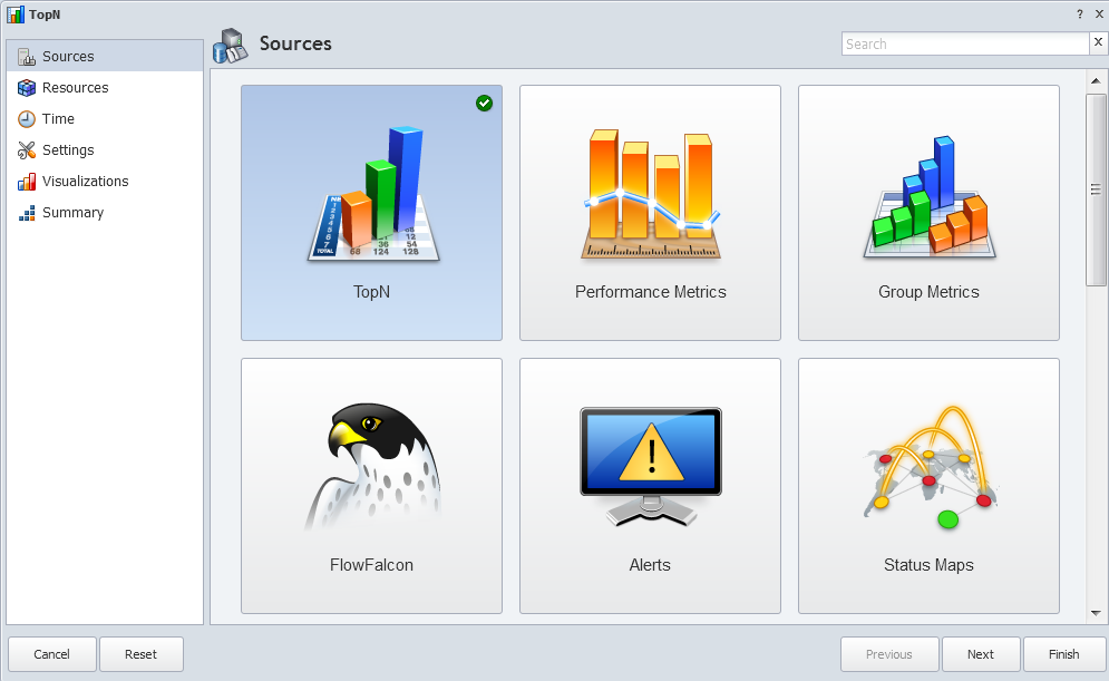
Attachment Sources
The Sources page enables you to select the source of the data to populate the attachment. Your source selection determines which fields appear on the subsequent wizard pages. As you proceed through the wizard pages, the source you select displays on the upper left side above the page navigation controls. Select one of the following sources:
-
TopN - to create an attachment that displays the top <n> items.
-
Performance Metrics - to create a graph attachment of the data from plugins such as SNMP, IP SLA, xStats, etc.
-
Group Metrics - to create an attachment that displays data aggregated by device group/device type or by object group. Not available for report templates.
-
FlowFalcon - to create an attachment that displays flow data. Not available for report templates.
-
Alerts - to create an attachment that displays alert data.
-
Status Maps - to create an attachment that displays the physical or geographic layout of your network with status indicators. Not available for report templates or chaining.
-
Devices - to create an attachment that displays device configuration information and object counts.
-
Device Groups - to create an attachment that displays the device group/device type hierarchy and the devices that are associated to the device group/device type. Not available for report templates.
-
Objects - to create an attachment that displays object configuration information and poll details. Not available for report templates.
-
Object Groups - to create an attachment that displays the object groups and the objects that are associated to the object group. Not available for report templates.
-
Metadata - to create an attachment that displays data attributes that are specific to your network. Not available for report templates or chaining.
-
Topology - to create an attachment that displays network topology.
TopN Source
The TopN source enables you to create attachments that display a list of the hot spots in your network. The wizard selects the TopN source by default in new attachment workflows. Select the TopN source, if needed, and click one of the following:
-
Finish - to display the report with a TopN attachment that uses the Most Utilized Interfaces (In & Out) view for the time span of Today.
-
Next - to display one of the following wizard pages:
-
The Resources page appears for report workflows.
-
The Time page appears for report template workflows.
-
The Chaining page appears for chaining workflows.
-
TopN - Resources/Chaining
-
TopN Report does not create or allow you to change the timespan to Past 2 Hours because the NMS's data aggregation function, which runs every 2 hours, often results in empty or inaccurate TopN reports when selecting the Past 2 Hours timespan.
-
Any TopN Report attachment that exists in Report Manager and is not chained from an attachment with a timespan of Past 2 Hours will be changed to Past 4 Hours. However, if reports such as Alerts, Performance Metrics, etc. have a timespan of Past 2 Hours and is chained to a TopN report, the timespan for the TopN will be Past 2 Hours.
-
Sometimes there is not enough data to generate a chained TopN report for Past 2 Hours. TopN reports with timespans of Past 2 Hours as a result of chaining may be blank if aggregated data is not yet available.
Resources
For report workflows, the Resources wizard page enables you to select the resources to graph. Leave the Current Resources field clear to include all devices, device groups/device types, or object groups.
-
Click the Type drop-down and perform one of the following actions. You can select multiple resources and as you select each resource, it appears in the Current Resources list.
-
Select Device. Then click the Device drop-down and select the devices to report on.
-
Select Device Group. Then click the Device Group drop-down and select the device groups/device types to report on.
-
Select Object Group. Then click the Object Group drop-down and select the object groups to report on.
-
-
If you select more than one device group/device type or more than one object group, click the Member of Any drop-down and select one of the following:
-
Member of Any - to include devices as an OR operator (e.g., run a report for devices that are either in Group 1 OR in Group 2 OR in Group 3).
-
Member of All - to include devices as an AND operator (e.g., run a report for devices that are in all groups you select; in Group 1 AND in Group 2 AND in Group 3).
-
-
Click Next to display the Time wizard page.
Chaining
For chaining workflows, the Chaining wizard page enables you to set the resource limit and to split the results into separate attachments.
-
In the Resource Limit field, enter the number of resources to display in the chained attachment.
-
Select a Display Results option:
-
Combined - to create one attachment that displays all applicable results.
-
Split - to create multiple attachments, displaying one result per attachment.
-
-
Click Next to display the Time wizard page.
TopN - Time
-
TopN Report does not create or allow you to change the timespan to Past 2 Hours because the NMS's data aggregation function, which runs every 2 hours, often results in empty or inaccurate TopN reports when selecting the Past 2 Hours timespan.
-
Any TopN Report attachment that exists in Report Manager and is not chained from an attachment with a timespan of Past 2 Hours will be changed to Past 4 Hours. However, if reports such as Alerts, Performance Metrics, etc. have a timespan of Past 2 Hours and is chained to a TopN report, the timespan for the TopN will be Past 2 Hours.
-
Sometimes there is not enough data to generate a chained TopN report for Past 2 Hours. TopN reports with timespans of Past 2 Hours as a result of chaining may be blank if aggregated data is not yet available.
The Time wizard page enables you to define the attachment time span and sort settings.
-
Click the Time Span drop-down. You can select multiple time spans. This enables you to see overall changes over time in one attachment. For the calculation details, please refer to TopN Reports. The time span header in the TopN report displays the actual time span used, which may be slightly different from the requested time span. This does not affect the data returned.
Example: An attachment can list the top 10 most utilized interfaces for this month, and show their utilization information for today and over the last three months.
-
Custom
-
Select Specific to display fields that enable you to define a specific time span.
-
Select Relative to display a text field where you can enter a relative time span that uses natural language processing such as past 4 hours, last week, this month, today – last week, this week – last month.
-
Select Week to display a pop-up that enables you to designate a specific week in the year by number (e.g., week 23), to change when the year begins, and to designate that the first day of the week is a day other than Sunday.
-
-
Historical
-
Select Today to display data from 12:00am today until now.
-
Select Past <n> Hours, Days, Weeks to display data from <n> hours, days, or weeks ago until now.
-
Select Yesterday to display data from 12:00am yesterday until 12:00am today.
-
Select This Week, Month, Quarter to display data from 12:00am on the first day of the week, month, or quarter until now.
-
Select Last Week, Month, Quarter to display data from 12:00am on the first day of the last completed week, month, or quarter to 11:59pm on the last day of the last completed week, month, or quarter.
The shorttermhourly table is loaded in 2 hour intervals. Due to this, in almost every scenario, reports for the Past <n> Hours and Today intervals do not match.
-
-
Projected - Attachments can display future projections based on historical trends. SevOne NMS performs a linear interpolation based on historical data that extends six times the length of the projected interval into the past.
-
Select Next <n> to project data for the next <n> days, months, or year.
-
-
-
Click the Time Zone drop-down and select a time zone.
-
Click the Aggregation drop-down. Available options are dependent on the selection you make in the Time Span field.
-
Select Auto to use the fastest/most applicable frequency aggregation.
-
Select Hourly to use data stored in hourly buckets. You define how long to store data in hourly buckets on the Cluster Manager > Cluster Settings tab. Hourly buckets are useful when the time span is less than one week.
-
Select Daily to use data stored in daily buckets. You define how long to store data in daily buckets on the Cluster Manager > Cluster Settings tab. Daily buckets are useful when the time span is between the one week and three months.
-
Select Weekly to use data stored in weekly buckets. Data stays in weekly bucket for 365 days. Weekly buckets are useful when the time span is between three months and one year.
-
Select Monthly to use data stored in monthly buckets. Data stays in monthly buckets for 730 days. Monthly buckets are useful when the time span is between one year and two years.
-
-
Click the Sort By drop-down and select the time span to sort the data on. This is important when you select several time span options. When you select to sort by a projected time span, additional options become available on the Settings wizard page.
-
Click the Sort Order drop-down and select Ascending to sort data in ascending order or Descending to sort data in descending order.
-
Click Next.
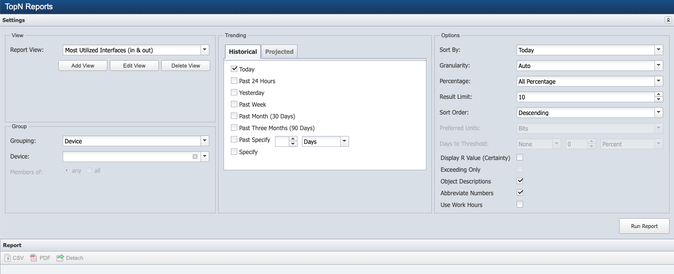
TopN - Settings
The Settings wizard page enables you to define attachment settings including the TopN view. Views define the data to appear in the report. SevOne NMS provides starter set TopN views to enable you to create common TopN attachments. Please refer to section Manage TopN Views below.
-
Click the View drop-down and select a view. Add View, Edit View, and Delete View enable you to manage TopN views. Delete View does not appear for starter set views because you cannot delete the starter set views.
-
In the Result Limit field, enter the number of results to display.
-
Select the Percentage check box to compare capacity or leave clear to compare the relative values of the different metrics.
-
Click the Preferred Units drop-down and select Bits to format the unit of measure as bits where applicable. If the unit of measure is not compatible to bits and you select this option, the report displays the unit of measure of the first indicator type in the view. Select Bytes to format the unit of measure in bytes.
-
The Days To Threshold fields enable you to define a data threshold when you select to Sort By a projected time span on the Time page. Perform one of the following actions:
-
Click the first drop-down and select None. Then enter 0 (zero) in the numeric field and select Percent (default) from the second drop-down to not define a threshold.
-
Click the first drop-down and select Less Than. Then enter the threshold value in the numeric field and select the unit of measure from the second drop-down to define a threshold for declining values.
-
Click the first drop-down and select Greater Than. Then enter the threshold value in the numeric field and select the unit of measure from the second drop-down to define a threshold for increasing values.
-
-
Select the Display R Value (Certainty) check box to display the percentage of data points that were relevant to the display of a projected trend.
-
Select the Exceeding Only check box to only display objects projected to exceed 100 percent for the time span you select.
-
Click the Work Hours drop-down and select one of the following:
-
None - to include all data for the device.
-
Device Work Hours - to include data for the work hours that you associate with the device on the Edit Device page.
-
-
Click Next.
TopN - Visualizations
The Visualizations wizard page enables you to define how you want to display the report data. The visualizations you select display  . When you select multiple visualizations, the attachment displays the report data in each of the visualizations you select.
-
Pie - displays the data as a pie graph. This visualization is useful for percent reports.
-
Table - displays the data in a table format.
-
Hidden - creates an attachment that does not display in the report. This enables you to use this attachment to create other (children) chained attachments without displaying this attachment in the report. If you select the Hidden visualization, all other visualizations are disabled and unavailable.
For the Pie visualization, click  to display the following settings:
-
Select the Display Logo check box to display a logo in the attachment.
-
Select the Display Legend check box to display a legend in the attachment. When you select to display the legend, the next check box is enabled.
-
Select the Display Minimum check box to display the minimum data point in the legend.
-
Select the Display Time Span check box to display the time span in the attachment.
For the Table visualization, click
to display the following settings:
-
The Columns fields enable you to define the data columns to display. Move the columns to display to the Using field on the right. Select a row and click the green arrows on the right to change the column display sequence.
-
Select the User Friendly Times check box to use human-readable dates in the .csv file. Leave clear to use a UNIX time stamp in the .csv file, which enables further manipulation of the data.
-
Select the Abbreviate Numbers check box to abbreviate large numbers (e.g., 5000 becomes 5K). Leave clear to enter the data precision in the Precision field.
Precision field is hidden when Abbreviate Numbers check box is selected.
-
Select the Display Actual Data Timespan check box to translate the relative time span displayed in the header to the actual time span that encompasses the available data. For example, if you select Today for the time span, the header will display the actual time span for the available data (e.g., 20 Feb '18 00:00:00 - 20 Feb '18 11:00:00), rather than displaying Today.
-
Select the CSV When Mailed check box to email the attachment in .csv format to the recipients you define on the Report Properties > Delivery tab. Leave clear to email the table as a .pdf file in the format that displays in the report. Selecting this check box enables you to select the check box for PDF/CSV When Mailed. Select this check box to include the attachment as a .pdf file and convert it to a .csv file when it is emailed.
-
Select the Wrap Cells check box to wrap long text in a data row so that all text displays. Leave clear to display as much text as fits into the cell with ellipses to indicate there is more text.
When you select the Hidden visualization, all other visualizations are deselected. When you finish the attachment definition and click Finish, the report appears without the attachment. Perform the following steps to chain from a Hidden visualization attachment.
-
In the report title bar, click
and select Edit Report to display the Report Properties. -
On the Report Properties, select the Report Structure tab, if needed.
-
Locate the Hidden visualization attachment in the list of attachments.
-
Right-click, select Chain and then select one of the following options:
-
Quick Chain - to create an attachment that contains the next logical set of data that is related to the current attachment. A tooltip displays the attachment source to create.
-
Custom - to display the Report Attachment Wizard pre-populated with the attachment settings from the Hidden visualization attachment.
-
Simple - to add a separator simple attachment or to add a text simple attachment to the report.
-
Click Next.
TopN - Summary
The Summary page displays a summary of the attachment definition.
-
Click on a row to navigate to the page where you can edit the item.
-
Click Finish to display the attachment in the report.
Manage TopN Views
Views enable you to define the indicator data to display in TopN attachments. For the list of starter set TopN views, please refer to TopN Reports.
From the navigation bar, click the Reports menu and select TopN Reports. Each step in this section is dependent on the preceding step.
-
Click Add View or Edit View to display a pop-up that enables you to manage the TopN views you use to create TopN attachments.
-
In the Report View Name field, enter the name of the view. When you edit a view, this field displays the view name. If the view is a starter set view, you must change the name before you can save your changes.
-
Click the Plugin drop-down and select the plugin that polls the object type to report on.
-
Click the Object Type drop-down and select the object type that contains the indicator to report on.
-
Select the Only Display Common Subtypes check box to filter the Object Subtype list to display only object subtypes you mark as common on the Object Subtype Manager. Please refer to Object Subtype Manager in SevOne NMS System Administration Guide.
-
Click the Object Subtype drop-down and select an object subtype.
-
Click the Indicator Type drop-down and select the indicator type to report on.
-
In the Indicator Alias field, enter the indicator name to display in the attachment.
Example: To have an Octets indicator display as Incoming Bandwidth.
-
Click the Aggregation drop-down and select one of the following options:
-
Average - to average all data in each data bucket to create the data point for each bucket.
-
Minimum - to find the minimum value in each data bucket to create the data point for each bucket.
-
Maximum - to find the maximum value in each data bucket to create the data point for each bucket.
-
Percentile - to enter a percentile. An additional field (Percentile) appears to enable you to enter the percentile. Indicators that you select Percentile for do not appear in reports for projected time spans, and the view must contain at least one indicator that is something other than Percentile.
-
-
Click the Filter Options drop-down and select a comparison operator to filter results. If you select a comparison operator other than None, fields appear to enable you to enter a filter value and to select the unit of measure for the filter value. This drop-down is not applicable for indicators that you select Percentile for in the Aggregation field above.
-
Select the Sorted Data check box to enable users to sort the results on the data from this indicator. Leave clear to display data for the indicator in the report without the ability to sort the report on its data. This check box is not applicable for indicators that you select Percentile for in the Aggregation field above.
-
Click Add Indicator to add the indicator to the Current Indicators list and to the view.
-
Click Clone (which appears after you select the check box for the indicator) or repeat the previous steps to add additional indicators to the Current Indicators list and to the view.
-
In the Current Indicators list, click the Default Direction drop-down and select to sort data in either Ascending or Descending order.
-
Click Save. The view is available from the View drop-down on the Settings wizard page.
CSV downloads can fail when the PHP-FPM memory limit is reached. In such situations, the following error message will appear on the screen:
Memory limit exceeded. Please reduce the number of indicators, the timeframe, or choose a higher aggregation.
SevOne does not recommend increasing the memory limit as it can impact other operations. Please perform the suggested action for a successful CSV download.
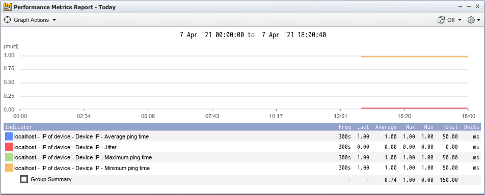
Performance Metrics Source
The Performance Metrics source enables you to create attachments that display statistical graphs for the objects and indicators on devices. On the Sources page, click Performance Metrics to display one of the following wizard pages:
-
The Resources page appears for report workflows.
-
The Chaining page appears for report template workflows and for chaining workflows.
Performance Metrics Report limits the amount of indicators to 1,000 indicators or less unless the table visualization is the only one being used. With table visualization, more than 10,000 indicators are allowed and the number can vary depending on the timespan of the report.
Performance Metrics - Resources/Chaining
Resources (Report Workflows)
For report workflows, the Resources wizard page enables you to select the indicators to graph.
-
Click the Type drop-down. You can select multiple resources and as you select each resource it appears in the Current Resources list.
-
Select Indicator to report on data from specific indicators on a specific device.
-
Click the Device Group drop-down and select a device group/device type to filter the list of devices.
-
Click the Device drop-down and select the device that contains the objects to report on.
-
Click the Object drop-down and select the objects that contain the indicators to report on. You can select multiple objects.
-
Click the Indicator drop-down and select the indicators to report on.
-
-
Select Device Group Member to report on data from a group of indicators polled by a specific plugin across multiple devices.
-
Click the Device Group drop-down and select the device group/device type to report on.
-
Click the Plugin drop-down and select the plugin that polls the object type to report on.
When Plugin is switched, the resources in the Performance Metrics attachment are cleared. Changing the Plugin will remove all records.
-
Click the Object Type drop-down and select the object type that contains the indicator types to report on.
-
Click the Indicator Type drop-down and select the indicator types to report on.
-
-
Select Object Group Member to report on data from a group of indicators polled by a specific plugin across multiple objects.
-
Click the Object Group drop-down and select the object group that contains the object types to report on.
-
Click the Plugin drop-down and select the plugin that polls the object type to report on.
When Plugin is switched, the resources in the Performance Metrics attachment are cleared. Changing the Plugin will remove all records.
-
Click the Object Type drop-down and select the object type that contains the indicator types to report on.
-
Click the Indicator Type drop-down and select the indicator types to report on.
If Type is changed, the resources in the Performance Metrics attachment are cleared. Changing the Type will remove all records.
-
-
-
Repeat the steps in this section to add additional resources.
-
After you select resources, there are two paths:
-
Click Finish to create a Performance Metrics attachment with the default settings.
-
Click Next to display the Time page.
-
Chaining
For report template workflows and for chaining workflows, the Chaining wizard page enables you to set the resource limit and to split the results into separate attachments.
-
In the Resource Limit field, enter the number of resources to display in the chained attachment.
-
Select a Display Results option:
-
Combined - to create one attachment that displays all applicable results.
-
Split - to create multiple attachments, one result per attachment.
-
-
Click Next to display one of the following pages:
-
The Resources page appears for report template workflows.
-
The Time page appears for chaining workflows.
-
Resources (Report Templates Workflow)
For report template workflows, the Resources wizard page enables you to select the indicator types for which the report template is to be applicable.
-
Click the Plugin drop-down and select the plugin that polls the object type to report on.
When Plugin is switched, the resources in the Performance Metrics attachment are cleared. Changing the Plugin will remove all records.
-
Click the Object Type drop-down and select the object type that contains the indicator types to report on.
-
Click the Indicator Type drop-down and select the indicator types to report on. You can select multiple indicator types and as you select each indicator type it appears in the Current Resources list.
-
Repeat the steps in this section to add additional resources.
-
Click Next to display the Time page.
Performance Metrics - Time
The Time wizard page enables you to define the attachment time span.
-
Click the Time Span drop-down.
-
Custom
-
Select Specific to display fields to enable you to define a time span.
-
Select Relative to display a text field where you can enter a relative time span using natural language processing such as past 4 hours, last week, this month, today – last week, this week – last month.
-
Select Week to display a pop-up that enables you to designate a specific week in the year by number (e.g., week 23), to change when the year begins, and to designate that the first day of the week is a day other than Sunday.
-
-
Historical
-
Select Today to display data from 12:00am today until now.
-
Select Past <n> Hours, Days, Weeks, Months to display data from <n> hours, days, or weeks ago until now.
-
Select Yesterday to display data from 12:00am yesterday until 12:00am today.
-
Select This Week, Month, Quarter to display data from 12:00am on the first day of the week, month, or quarter until now.
-
Select Last Week, Month, Quarter to display data from 12:00am on the first day of the last completed week, month, or quarter to 11:59pm on the last day of the last completed week, month, or quarter.
-
-
-
Click the Time Zone drop-down and select a time zone.
-
Click Next.
Performance Metrics - Settings
The Settings wizard page enables you to adjust the attachment default settings. When you choose to use aggregation, data is grouped into buckets based on the Time Span you select on the Time page and the aggregation size you enter. Data in each bucket is then aggregated to create one data point on the graph per bucket. Each bucket contains the data for each aggregation size interval.
Example: Select Past 8 Hours from the Time Span drop-down on the Time page and enter 10 Minutes in the Aggregation Size fields to create 48 buckets and 48 data points.
-
Select the Percentage check box to compare capacity. Leave clear to compare the relative values of the different metrics.
-
Select the Use Aggregation check box to create aggregated data points. Leave clear to graph all data without aggregation.
-
If you select the Use Aggregation check box, click the Aggregation Type drop-down and select one of the following options:
-
Auto - to use the highest applicable frequency aggregation. The Bar, Stacked Bar, and Stacked Line visualizations use Auto aggregation.
-
Average - to calculate the average values in each bucket (sum all the values in the bucket divided by the number of values in the bucket) to create a graph where each data point is the average value per aggregation size interval.
-
Minimum - to find the lowest value in each bucket to create a graph where each data point is the minimum value for each aggregation size interval.
-
Maximum - to find the highest value in each bucket to create a graph where each data point is the maximum value for each aggregation size interval.
-
Total - to add all data in each bucket to create a graph where each data point is the total amount of data for each aggregation size interval. The value varies depending on the indicator type. For example,
-
Gauge - sum of all the data points displayed. i.e., if data points are displayed in bits, total will display in bits as well.
Example: for GaugeAn indicator type representing total VPN connection attempts is stored as a gauge, measured as number, and polled at 5 minute frequency. When viewing a report for the Past 30 minutes, all values for the indicator are 4. For this scenario, the total VPN connection attempts for the past 30 minutes is 24. i.e., 6 poll points x 4 attempts per poll.
-
Counter - area below the line graph. i.e., if data is displayed in bps (bits per second), total will display in bits and not in bps.
Example: for CounterAn indicator type representing VPN connection bandwidth is stored as a counter, measured as bps (a rate based unit), and polled at 5 minute frequency. When viewing a report for the Past 30 minutes, all values for this indicator are 100 bps. For this case, the total VPN connection bandwidth for the past 30 minutes is 180,000 bits. i.e., 100 bps x 60 seconds x 30 minutes.
-
-
-
If you select an aggregation type other than Auto, in the Aggregation Size Period field, enter the amount of time you want to collect data before data is saved and a new bucket is created. Then click the Aggregation Size Unit drop-down and select the unit of measure for the aggregation size time period.
-
If you select the Use Aggregation check box, click the Aggregation Alignment drop-down and select one of the following options:
-
Aligned To Interval - to align all the aggregation points by interval where results are on the fixed timestamps depending on the aggregation interval.
-
Aligned To Start Time - to align all the aggregation points to the start time of the report.
-
-
Click the Trending drop-down and select one of the following options. For details regarding trend calculations, please refer to topic Instant Graphs.
-
None - to disable trending.
-
Standard Trend - to trend the data for the time span you define. This only considers data collected within the time period you specify for the graph to calculate the trend line.
-
Historical Trend - to trend data six times back in history. This considers all data in the time period you specify for the graph, plus an additional 5x as much time before the graph begins.
-
Projected Trend - to consider all data in the time period you specify, plus an additional 5x as much time as the difference between the time to project data until and the time the graph ends, assessed back from the time that the graph ends. If you select this option, enter the number of days in the Projection Time field.
-
-
If you select a Trending other than None, click the Trending Type drop-down and select one of the following options:
-
Linear - to display a linear trend line. Data is linear if the data point pattern resembles a line. A linear trend line typically shows that something increases or decreases at a steady rate.
-
Exponential - to display a curved trend line for data values that rise or fall at increasingly higher rates.
-
Logarithmic - to display a logarithmic trend line for a curved line that is most useful when the rate of change in the data increases or decreases quickly and then levels out.
-
Power - to display a curved trend line to compare measurements that increase at a specific rate.
-
-
Select the Display Percentiles check box to evaluate the regular and sustained utilization of the indicator data and calculate the percentage of usage you define. If you select this check box, the Percentiles field enables you to enter the percentage. The Line visualization displays an additional line on the graph and other visualizations display this information in the legend.
-
Select the Display Baselines check box to display each indicator's baseline on the graph. Baselines appear on the graph as dashed, light colored, box shaped lines. If you select this check box, the Standard Deviation field enables you to enter a standard deviation that displays the measure of dispersion in a frequency distribution equal to the square root of the mean of the squares of the deviations from the arithmetic mean of the distribution.
-
Select the Use Time Over Time check box to add a second data representation to the graph. This enables you to display data for a specific period of time on the graph. Time over time graphs use aggregated data.
If you did not select the Use Aggregation check box in step 2 of this section, the Use Aggregation check box now appears selected and disabled. The Aggregation Type defaults to Auto and can be changed as described in step 3.
If you select this check box, perform the following steps.
-
Click the Time Over Time Type drop-down and select one of the following options:
-
Average - to display the average value for each data point in the time period.
-
Minimum - to display the lowest value for each data point in the time period.
-
Maximum - to display the highest value for each data point in the time period.
-
Total - to display the sum of all data for each data point in the time period.
-
-
In the Time Over Time Period text field, enter a number for the length of the interval then click the drop-down and select the unit of measure for the time period.
-
Select the Display Only Averaged Indicator check box to display only the time over time line on the graph without any other indicator data. Leave clear to display both indicator data and time over time data.
-
-
Select the Display Group Summary check box to display group summary. It reports on the following:
-
Total of all indicators in a time series (total of totals).
-
Average of all indicators over a time series (total of totals / count of inputs over timespan).
-
Minimum value of all discrete data points in the time series (min-min).
-
Maximum value of all discrete data points in the time series (max-max).
Indicators that are not of similar type will result in mixed data units and undesired results.
-
-
Click the Work Hours Group drop-down and select one of the following options:
-
None- to include all data for the device in the report.
-
Device Work Hours- to include data for the work hours that you associate with the device on the Edit Device page.
-
Custom- to display fields that enable you to define custom work hours.
-
System Default- to include data for the work hours you designate to be the default work hours.
Select a work hour group you define on the Work Hours page. For details, please refer to section Work Hours in SevOne NMS System Administration Guide.
-
-
Select the Display Maintenance Windows check box to include a transparent gray background in the graph indicating the time of day any device is in one or more maintenance windows.
-
Click Next.
Performance Metrics - Visualizations
The Visualizations wizard page enables you to define how you want to display the report data. The visualizations you select display
. When you select multiple visualizations, the attachment displays the report data in each of the visualizations you select. The visualizations that appear are dependent on the resources you select.
-
Line - overlays all indicators and displays each indicator with its own line. You can define line graphs to display trends and to display past data as an additional line on the graph.
-
Bar - displays a graph of qualitative independent variables such as when you need to compare the in octets of two or more routers.
-
Pie - displays the data as a pie graph. This visualization is useful for percent reports such as when you need to graph the available hard drive space on a device.
-
Stacked Line - displays each graph line stacked above the prior graph line to better visualize how values compare as a whole. A stacked line graph extracts the poll points that occur at different times and calculates the averages to plot the data points on the graph as though they occur at the same time.
-
Stacked Bar - displays each graph bar stacked above the prior graph bar to better visualize how values compare as a whole.
-
Radial - display the data as a gauge.
-
Calendar - displays indicator performance over time. If you select the Calendar visualization, all other visualizations are disabled and unavailable.
-
Table - displays the data as a table.
-
Hidden - creates an attachment that does not display in the report. This enables you to use this attachment to create other (children) chained attachments without displaying this attachment in the report. If you select the Hidden visualization, all other visualizations are disabled and unavailable.
For the Line, Bar, Pie, Stacked Line, Stacked Bar, and Radial visualizations, click
to display the following settings:
-
Select the Display Logo check box to display a logo in the attachment.
-
Click the Color Scheme drop-down and select All Green to display an all green background, select Green to Red to display green on the left, or select Red to Green to display red on the left. Radial visualization only.
-
Select the Display Legend check box to display a legend in the attachment. When you select to display the legend, the following check boxes are available.
-
Select the Display Frequency check box to display the poll frequency in the legend.
-
Select the Display Last Poll check box to display the value of the last successful poll in the legend.
-
Select the Display Aggregation check box to display the type of aggregation you select for the calculation of the data in the legend.
-
Select the Display Average check box to display the average in the legend.
-
Select the Display Maximum check box to display the data peak point in the legend.
-
Select the Display Minimum check box to display the minimum data point in the legend.
The values in the legend are calculated based on the values returned for the report.
-
-
Select the Display Time Span check box to display the time span in the attachment.
-
Select the Display Outline check box to have the graph appear within an outline within the attachment. Not applicable for the Pie visualization.
-
Select the Scaled to Max check box to scale the graph to the largest actual value present. Leave clear to scale the graph to the maximum potential data value. This check box is irrelevant for indicators that do not have a defined maximum value and is not applicable for the Pie visualization.
-
Select the Dual Y-Axes check box to display a Y axis on the left of the graph and a Y axis on the right of the graph. This is useful when graph results are diverse. The legend displays triangles to indicate which axis the graph item uses. Line visualization only.
-
Select the Rounded Y Axis Value check box to round all left-hand Y axis grid line values and to round the top right-hand Y axis grid line value when you have dual Y axes. Not applicable for Pie or Radial visualizations.
-
Select the Rounded X Axis Value check box to round the X axis grid line values. Not applicable for Pie or Radial visualizations.
-
Select the Scale to Minimum Value check box to scale the graph from maximum down to the minimum actual value. Leave clear to scale the graph from maximum down to zero. Not applicable for Pie, Stacked Line, Stacked Bar, or Radial visualizations.
-
Select the Logarithmic Scaling check box to more accurately reflect data that is affected by a large spike which causes the rest of the graph to appear flat. Line visualization only.
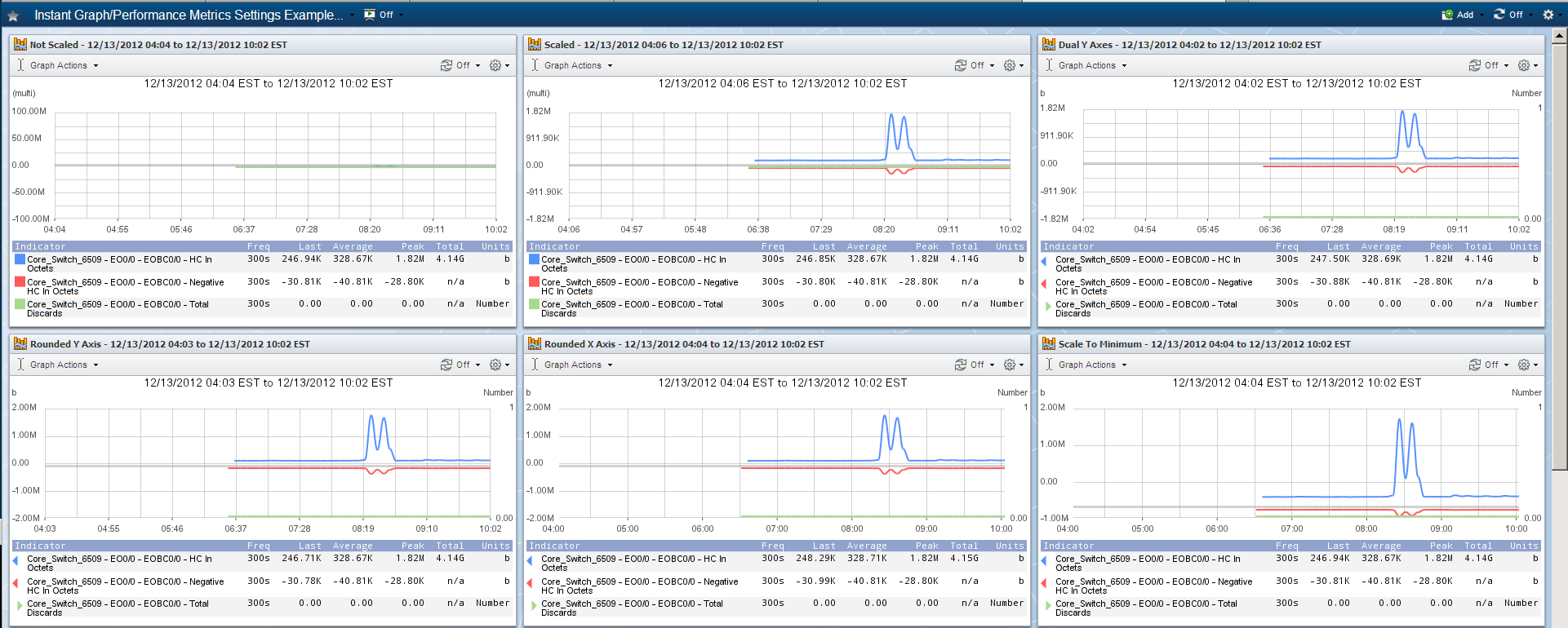
Exact Same Graph with Different Visualization Settings
When you select the Calendar visualization, all other visualizations are deselected. Click
to display the following settings.
-
Click the Calendar Type drop-down and select one of the following options:
-
Day - to display an attachment with daily graphs for the time span you select.
-
Week - to display an attachment with weekly graphs for the time span you select, starting on Sunday.
-
Month - to display an attachment with monthly graphs for the time span you select.
-
Quarter - to display an attachment with quarterly graphs for the time span you select.
-
Year - to display an attachment with a yearly graph for the time span you select.
-
For the Table visualizations, click
to display the following settings.
-
The Columns fields enable you to define the data columns to display. Move the columns to display to the Using field on the right. Select a row and click the green arrows on the right to change the column sequence.
-
Select the User Friendly Times check box to use human-readable dates in the .csv file. Leave clear to use a UNIX time stamp in the .csv file, which enables further manipulation of the data.
-
Select the Abbreviate Numbers check box to abbreviate large numbers (e.g., 5000 becomes 5K). Leave clear to enter the data precision in the Precision field.
Precision field is hidden when Abbreviate Numbers check box is selected.
-
Select the CSV When Mailed check box to email the attachment in .csv format to the recipients you define on the Report Properties > Delivery tab. Leave clear to email the table as a .pdf file in the format that displays in the report. Selecting this check box enables you to select the check box for PDF/CSV When Mailed. Select this check box to include the attachment as a .pdf file and convert it to a .csv file when it is emailed.
-
Select the Wrap Cells check box to wrap long text in a data row so that all text displays. Leave clear to display as much text as fits into the cell with ellipses to indicate there is more text.
When you select the Hidden visualization, all other visualizations are deselected. When you finish the attachment definition and click Finish, the report appears without the attachment. Perform the following steps to chain from a Hidden visualization attachment:
-
In the report title bar, click
and select Edit Report to display the Report Properties. -
On the Report Properties, select the Report Structure tab, if needed.
-
Locate the Hidden visualization attachment in the list of attachments.
-
Right-click, select Chain, and then select one of the following options:
-
Quick Chain - to create an attachment that contains the next logical set of data that is related to the current attachment. A tooltip displays the attachment source to create.
-
Custom - to display the Report Attachment Wizard pre-populated with the attachment settings from the Hidden visualization attachment.
-
Simple - to add a separator simple attachment or to add a text simple attachment to the report.
-
Click Next.
Performance Metrics - Summary
The Summary wizard page enables you to view a summary of the attachment definition.
-
Click on a row to navigate to the page where you can edit the item.
-
Click Finish to display the report.
CSV downloads can fail when the PHP-FPM memory limit is reached. In such situations, the following error message will appear on the screen:
Memory limit exceeded. Please reduce the number of indicators, the timeframe, or choose a higher aggregation.
SevOne does not recommend increasing the memory limit as it can impact other operations. Please perform the suggested action for a successful CSV download.
When a Performance Metrics report is created using SevOne NMS REST API, the report graph does not have columns Min, Freq, Last, and Total. However, these columns appear when the same is done using SevOne NMS user interface.
Here is an example to create Performance Metrics report using REST API with the same default settings used when creating the same using SevOne NMS user interface.
{ "name": "CreatedViaRESTAPI", "resources": [ { "indicators": [ { "deviceId": <your-device-id>, "objectId": <your-object-id>, "pluginId": <your-plugin-id>, "ids": [ <your-indicator-id-1>, <your-indicator-id-2>, <...>, <your-indicator-id-n> ] } ] } ], "time": { "ranges": { "type": "RelativePeriod", "start": "Today", "end": null, "options": null }, "timezone": "America/New_York" }, "settings": { "rawData": { "dataAggregation": { "useAggregation": false, "aggregationType": null, "aggregationValue": null, "aggregationUnits": null }, "rawData": { "trend": "none", "trendType": "linear", "projectionTime": 7, "usePercentiles": false, "percentiles": 95, "useBaseline": false, "standardDeviation": 0, "useTimeOverTime": false, "timeOverTimeType": "minimum", "timeOverTimeValue": 1, "timeOverTimeUnits": "week", "timeOverTimeOnly": false, "fitTimeSpanTo": null, "reduceData": null }, "units": { "percentage": false, "preferredUnits": "bits" }, "workHours": { "type": "none", "workHoursGroupId": null, "customWorkhours": null }, "csv": { "expandTimeseries": true, "formatTimestamp": true } }, "sourceFields": { "fields": [], "sort": [] } }, "visualization": { "csv": null, "line": { "showTitle": false, "showLegend": true, "showFrequency": true, "showLast": true, "showAggregation": false, "showAverage": true, "showPeak": true, "showTimespan": true, "showValley": true, "drawGraphOutline": false, "scaled": true, "dualYAxes": false, "prettyYAxis": true, "prettyXAxis": true, "scaleToMinimumValue": false, "logScale": false }, "stackedLine": null, "bar": null, "stackedBar": null, "pie": null, "radial": null, "table": null }}Group Metrics Source
The Group Metrics source enables you to create attachments that aggregate data at the device group/device type level or the object group level. The Group Metrics source is not available for report templates. On the Sources page, click Group Metrics to display one of the following wizard pages:
-
The Resources page appears for report workflows.
-
The Chaining page appears for chaining workflows.
Group Metrics - Resources/Chaining
Resources
For report workflows, the Resources wizard page enables you to select the indicators to graph. Each attachment can graph up to 1000 indicators from any number of different device groups or object groups on the same graph.
-
Click the Group Type drop-down and perform one of the following actions:
-
Select Device Groups. Then click the Device Groups drop-down and select the check box for each device group/device type to report on.
-
Select Device Groups Children. Then click the Device Groups drop-down and select the check box for each parent device group/device type to graph poll data from the device groups/device types that are subordinate to the device groups/device types you select.
-
Select Object Groups. Then click the Object Groups drop-down and select the object groups to report on.
-
-
Click the Plugin drop-down and select the plugin that polls the object type to report on.
-
Click the Object Type drop-down and select the object type that contains the indicator types to report on.
-
Click the Indicator Types drop-down and select the indicator types to report on. You can select multiple indicator types.
-
Click the Aggregations drop-down and select the aggregations to use to calculate the data points. As you select aggregations, the resource appears in the Current Resources list.
-
Repeat the steps in this section to add additional resources.
-
Click Next to display the Time page.
Chaining
For chaining workflows, the Chaining wizard page enables you to set the resource limit and to split the results into separate attachments.
-
In the Resource Limit field, enter the number of resources to display in the chained attachment.
-
Select a Display Results option:
-
Combined - to create one attachment that displays all applicable results.
-
Split - to create multiple attachments, one result per attachment.
-
-
Click Next to display the Time page.
Group Metrics - Time
The Time wizard page enables you to define the attachment time span.
-
Click the Time Span drop-down.
-
Custom
-
Select Specific to display fields to enable you to define a specific time span.
-
Select Relative to display a text field where you can enter a relative time span that uses natural language processing such as past 4 hours, last week, this month, today – last week, this week – last month.
-
Select Week to display a pop-up that enables you to designate a specific week in the year by number (e.g., week 23), to change when the year begins, and to designate that the first day of the week is a day other than Sunday.
-
-
Historical
-
Select Today to display data from 12:00am today until now.
-
Select Past <n> Hours, Days, Weeks to display data from <n> hours, days, or weeks ago until now.
-
Select Yesterday to display data from 12:00am yesterday until 12:00am today.
-
Select This Week, Month, Quarter to display data from 12:00am on the first day of the week, month, or quarter until now.
-
Select Last Week, Month, Quarter to display data from 12:00am on the first day of the last completed week, month, or quarter to 11:59pm on the last day of the last completed week, month, or quarter.
-
-
-
Click the Time Zone drop-down and select a time zone.
-
Click Next.
Group Metrics - Settings
The Settings wizard page enables you to set the preferred unit.
-
Click the Preferred Units drop-down and select Bits for network-oriented data or select Bytes for server-oriented data.
-
Click Next.
Group Metrics - Visualizations
Group Metrics attachments use the Table visualization. Click
to define the following settings:
-
The Columns fields enable you to define the data columns to display. Move the columns to display to the Using field on the right. Select a row and click the green arrows on the right to change the column sequence.
-
Select the User Friendly Times check box to use human-readable dates in the .csv file. Leave clear to use a UNIX time stamp in the .csv file, which enables further manipulation of the data.
-
Select the Abbreviate Numbers check box to abbreviate large numbers (e.g., 5000 becomes 5K). Leave clear to enter the data precision in the Precision field.
Precision field is hidden when Abbreviate Numbers check box is selected.
-
Select the CSV When Mailed check box to email the attachment in .csv format to the recipients you define on the Report Properties > Delivery tab. Leave clear to email the table as a .pdf file in the format that displays in the report. Selecting this check box enables you to select the check box for PDF/CSV When Mailed. Select this check box to include the attachment as a .pdf file and convert it to a .csv file when it is emailed.
-
Select the Wrap Cells check box to wrap long text in a data row so that all text displays. Leave clear to display as much text as fits into the cell with ellipses to indicate there is more text.
-
Click Next.
Group Metrics - Summary
The Summary wizard page enables you to view a summary of the attachment definition.
-
Click on a row to navigate to the page where you can edit the item.
-
Click Finish to display the report.
CSV downloads can fail when the PHP-FPM memory limit is reached. In such situations, the following error message will appear on the screen:
Memory limit exceeded. Please reduce the number of indicators, the timeframe, or choose a higher aggregation.
SevOne does not recommend increasing the memory limit as it can impact other operations. Please perform the suggested action for a successful CSV download.
FlowFalcon Source
The FlowFalcon source enables you to create attachments for flow technologies to provide visual details of over or under utilization of a network resource, application traffic, and port conversation activity. The FlowFalcon source is not available for report templates. On the Sources page, click FlowFalcon to display one of the following wizard pages:
-
The Resources page appears for report workflows.
-
The Chaining page appears for chaining workflows.
FlowFalcon - Resources/Chaining
Resources
For report workflows, the Resources wizard page enables you to select the interfaces, device groups/device types, or object groups on which to look for flow data.
-
Click the Type drop-down and perform one of the following actions. You can select multiple resources and as you select each resource it appears in the Current Resources list.
-
Select Interface to graph flow data from the interfaces you allow on the Flow Interface Manager. For details, please refer to section Flow Interface Manager in SevOne NMS System Administration Guide.
-
Click the Device drop-down and select a device that flow data originates from. Select All Devices to graph flow data from all devices.
-
Click the Interface drop-down and select the interfaces that flow data originates from. Select All Interfaces to graph flow data from all interfaces on the device you select in the previous step.
-
Click the Direction drop-down and select whether to graph flow data that is Incoming, Outgoing, or for All Directions. Some flow sources only provide incoming data.
-
-
Select Device Group. Then click the Device Group drop-down and select the device groups/device types that flow data originates from.
-
Select Object Group. Then click the Object Group drop-down and select the object groups that flow data originates from.
-
-
Click Next to display the Time page.
You can click Finish to create an attachment that uses the Top Talkers (Bandwidth, Packets, Flows) view with the default settings for the resources you select.
Chaining
For chaining workflows, the Chaining wizard page enables you to set the resource limit and to split the results into separate attachments.
-
In the Resource Limit field, enter the number of resources to display in the chained attachment.
-
Select a Display Results option:
-
Combined - to create one attachment that displays all applicable results.
-
Split - to create multiple attachments, one result per attachment.
-
-
Click Next to display the Time page.
FlowFalcon - Time
The Time wizard page enables you to define the attachment time span.
-
Click the Time Span drop-down.
-
Custom
-
Select Specific to display fields to enable you to define a specific time span.
-
Select Relative to display a text field where you can enter a relative time span that uses natural language processing such as past 4 hours, last week, this month, today – last week, this week – last month.
-
Select Week to display a pop-up that enables you to designate a specific week in the year by number (e.g., week 23), to change when the year begins, and to designate that the first day of the week is a day other than Sunday.
-
-
Historical
-
Select Today to display data from 12:00am today until now.
-
Select Past <n> Hours, Days, Weeks to display data from <n> hours, days, or weeks ago until now.
-
Select Yesterday to display data from 12:00am yesterday until 12:00am today.
-
Select This Week, Month, Quarter to display data from 12:00am on the first day of the week, month, or quarter until now.
-
Select Last Week, Month, Quarter to display data from 12:00am on the first day of the last completed week, month, or quarter to 11:59pm on the last day of the last completed week, month, or quarter.
-
-
-
Click the Time Zone drop-down and select a time zone.
-
Click Next.
FlowFalcon - Settings
The Settings wizard page enables you to define attachment settings including the FlowFalcon view. Views define the data to appear in the report. SevOne NMS provides starter set FlowFalcon views to enable you to create common FlowFalcon attachments. The FlowFalcon View Editor enables you to create FlowFalcon views that are specific to your network. For details, please refer to section FlowFalcon View Editor in SevOne NMS System Administration Guide.
-
On the Settings tab on the Settings page, select the Aggregated Data check box to populate the View list with FlowFalcon views that use aggregated flow data (faster and less specific). Leave clear to populate the View list with views that use the raw flow data (more specific).
When you create a TopN flow report (e.g., Top Talkers) based on aggregated data, the report will not be entirely precise. You can increase the value for the Aggregation TopN setting (go to Cluster Manager > Cluster Settings tab > FlowFalcon subtab) for greater precision. However, any value greater than 100 will increase the system load, which may eventually lead to data loss.
-
Click the View drop-down and select a view. The list of views is dependent on the Aggregated Data selection you make in the previous step.
-
Click the Network Segment drop-down and select a network segment. This enables you to resolve IP addresses into segments and to roll up results from the same segment into a single result. The Network Segment Manager enables you to create and modify network segments. For details, please refer to section Network Segment Manager in SevOne NMS System Administration Guide.
-
Select the Graph Other check box to display the flow for the top <n> results individually in the Pie visualization and the Stacked Line visualization plus a Remaining Traffic graph item that groups the flow for the remaining flow sources that meet the filter criteria. You define <n> results in the next step. Leave clear to display only the top <n> results in the Pie visualization and the Stacked Line visualization. Remaining Traffic continues to display in the Table visualization.
-
In the Result Limit field, enter the number of individual results to display in the attachment. Filters enable you to narrow the scope of the request (please refer to section FlowFalcon - Filters below). You can also modify the Current Resources list to limit the number of resources.
-
Click the Preferred Units drop-down and select Bits for network-oriented data or select Bytes for server-oriented data.
-
On the FlowFalcon tab, click the Split drop-down and select one of the following options:
-
Nothing - to combine all results from the same direction across the same interface to allow for greater detail in the result set.
-
Interfaces - to separate flow data into individual interfaces.
-
Groups - to separate flow data by device group/device type or object group depending on the resource you select. This option appears when you select Device Groups or Object Groups on the Resources page.
-
-
Click the Display as drop-down and select Total to display the results as total volume or select Average Rate to display the results as rate or select Both to display the results as total volume and rate.
-
Click the Granularity drop-down and select the interval between data points in the results. SevOne NMS is optimized to receive flows every one minute. If you configure the router to send flows at a different interval, this setting enables you to view the report at the granularity that matches the router flow timeout setting. A router flow cache setting other than one minute is not recommended. Perform one of the following actions:
-
Select Auto to use the highest applicable granularity for the best display and fastest load time based on the Time Span you select on the Time page.
-
Select a predefined interval.
-
-
On the FlowFalcon Resolution tab,
-
Click the Display Application Id drop-down.
-
Select Display Octet Array to display the application id as a hexadecimal number.
-
Select Display Name to display the application name.
-
Select Display Both to display both the application id and application name.
-
-
Click the Display AS drop-down and select one of the following options:
-
Display Number - to see AS port numbers.
-
Display Name - to display AS port names.
-
Display Both - to display both numbers and resolved names.
-
-
Click the Display Country drop-down and select one of the following options:
-
Display Code - to display the country code.
-
Display Name - to display the country name.
-
Display Both - to display both, the country code and country name.
-
-
Click the Display DNS drop-down and select one of the following options:
-
Display IP - to display raw IP addresses.
-
Display DNS - to display resolved domain names when possible.
-
Display Both - to display both IP addresses and resolved domain names.
-
-
Click the Display DSCP drop-down and select one of the following options:
-
Display Number - to see DSCP port numbers.
-
Display Name - to display DSCP port names.
-
Display Both - to display both numbers and resolved names.
-
-
Click the Display Port drop-down and select one of the following options:
-
Display Number - to see raw port numbers.
-
Display Name - to display resolved port names.
-
Display Both - to display both numbers and resolved names.
-
-
Click the Display Protocol drop-down and select one of the following options:
-
Display Number - to display raw protocol numbers.
-
Display Name - to display resolved protocol names.
-
Display Both - to display both numbers and resolved names.
-
-
Click the Display Service Profile drop-down and select one of the following options:
-
Select Display Number to display service profile ids.
-
Select Display Name to display service profile names.
-
Select Display Both to display both ids and resolved names.
FlowFalcon Resolution can also be set from Application > FlowFalcon Reports > Resolution Settings drop-down > field Service Profile.
-
-
Click the Display Service Category drop-down and select one of the following options:
-
Select Display Number to display service category ids.
-
Select Display Name to display service category names.
-
Select Display Both to display both ids and resolved names.
FlowFalcon Resolution can also be set from Application > FlowFalcon Reports > Resolution Settings drop-down > field Service Category.
IMPORTANT-
Each Service Profile only belongs to one Service Category. It can be assigned to category OOTB (which includes other) or it can be assigned to a custom category.
-
If a flow is unidentifiable as a service, Service Profile is set to no service and Service Category is set to no category.
-
Both Service Profile and Service Category fields are added during collection of the data. If the user modifies Service Profile / Service Category definitions, the historical data does not change.
-
-
-
-
Click Next.
FlowFalcon - Filters
The Filters wizard page enables you to limit the results that appear in the attachment. Each filter contains one or more rules. Each filter rule applies to a specific flow field. A filter rule for a field not in the view is ignored.
When you apply a filter to an attachment that uses an aggregated view, the Remaining Traffic and Total Traffic numbers may appear inaccurate due to how data is aggregated and stored. If you do not receive the expected number of results after you apply a filter to an aggregated view, increase the number of aggregated results to store for each write interval on the Cluster Manager > Cluster Settings tab > FlowFalcon subtab > Aggregation TopN.
-
Click the left drop-down and select the field to define the rule on.
-
Click the second drop-down and select a comparison operator. For each attachment, a data row displays if allowed by all rules with the word NOT in the operator and allowed by any other rule (if existent).
The Operator options include Mask and Subnet (as well as Not Mask and Not Subnet ). Selecting Mask means that flow data has to match in the manner of IP address subnet mask. Selecting Subnet means that flow data has to be from the network segment that you specify in the drop-down to the right (the drop-down will appear when you select Subnet). For information about defining network segments, please refer to section Network Segment Manager in SevOne NMS System Administration Guide.
-
In the Enter Value field, enter the value to base the rule on.
-
Click Add Filter to display the rule in the Current Filters list.
-
Repeat these steps to add rules to the filter.
-
Click Next.
The filter Boolean expression works such that for each unique field, SevOne NMS creates a Boolean expression that consists of the negative rules and the positive rules. The negative rules are AND'd to form a sub-expression, and the positive rules are OR'd to form a sub-expression. These sub-expressions are then AND'd to form the final expression for each unique field. Then each unique field's composite expression is AND'd to other field expressions.
FlowFalcon - Visualizations
The Visualizations wizard page enables you to define how you want to display the report data. The visualizations you select display
. When you select multiple visualizations, the attachment displays the report data in each of the visualizations you select.
-
Pie - displays the data as a pie graph.
-
Stacked Line - displays each graph line stacked above the prior graph line to better visualize how values compare as a whole.
-
Table - displays the data as a table.
For the Pie and Stacked Line visualizations, click
to display the following settings:
-
Select the Display Logo check box to display a logo in the attachment.
-
Select the Display Legend check box to display a legend in the attachment. Stacked Line visualization only.
-
Select the Display Minimum check box to display the minimum data point in the legend. Enabled upon selection of the previous check box.
-
Select the Display Time Span check box to display the time span in the attachment. Stacked Line visualization only.
-
Select the CSV When Mailed check box to email the attachment in a .csv format to the recipients you define on the Report Properties > Delivery tab. Leave clear to email the table as a .pdf file in the format that displays in the report. Stacked Line visualization only.
For the Table visualization, click
to display the following settings:
-
The Columns fields enable you to define the data columns to display. Move the columns to display to the Using field on the right.
-
The column with the red number one ( 1 ) is the primary sort column and the data from this column displays in the Stacked Line visualization and in the Pie visualization.
-
Select a row and click the green arrows on the right to change the column sequence.
-
Within a row, click the gray up arrow or the down arrow to define the sort column and whether to display data in ascending or descending order.
-
 indicates you cannot remove this column from the table.
-
-
Select the User Friendly Times check box to use human-readable dates in .csv format. Leave clear to use a UNIX time stamp in the .csv file, which enables further manipulation of the data.
-
Select the Abbreviate Numbers check box to abbreviate large numbers (e.g., 5000 becomes 5K). Leave clear to enter the data precision in the Precision field.
Precision field is hidden when Abbreviate Numbers check box is selected.
-
Select the CSV When Mailed check box to email the attachment in a .csv format to the recipients you define on the Report Properties > Delivery tab. Leave clear to email the table as a .pdf file in the format that displays in the report. Selecting this check box enables you to select the check box for PDF/CSV When Mailed. Select this check box to include the attachment as a .pdf file and convert it to a .csv file when it is emailed.
-
Select the Wrap Cells check box to wrap long text in a data row so that all text displays. Leave clear to display as much text as fits into the cell with ellipses to indicate there is more text.
Click Next.
FlowFalcon - Summary
The Summary wizard page enables you to view a summary of the attachment definition.
-
Click on a row to navigate to the page where you can edit the item.
-
Click Finish to display the report.
Alerts Source
The Alerts source enables you to create attachments that display the current, active alerts in the system. On the Sources page, click Alerts to display the Aggregations wizard page.
Alerts - Aggregations
The Aggregations wizard page enables you to define what groups of alerts to include in the attachment.
You can click Finish to create an Alerts attachment that uses the default settings.
-
Select one of the following options:
-
No Aggregation - to display all current alerts.
-
Device - to display alerts for specific devices.
-
Device Group - to display alerts at the device group/device type level.
-
Object Group - to display alerts for specific object groups.
-
-
Click Next to display one of the following pages:
-
The Resources page appears for report workflows.
-
The Time page appears for report template workflows.
-
The Chaining page appears for chaining workflows.
-
Alerts - Resources/Chaining
Resources
For report workflows, the Resources wizard page enables you to select the devices, device groups/device types, or object groups to display alert data from. Leave the Current Resources field clear to include all devices, device groups/device types, or object groups.
-
Click the Type drop-down and perform one of the following actions. You can select multiple resources and as you select each resource it appears in the Current Resources list.
-
Select Device. Then click the Device drop-down and select the devices to report on.
-
Select Object. Click the Device drop-down and select the device that contains the object. Then click the Object drop-down and select the objects to report on.
-
Select Device Group. Then click the Device Group drop-down and select the device groups/device types to report on.
-
Select Object Group. Then click the Object Group drop-down and select the object groups to report on.
-
-
Click Next to display the Time page.
Chaining
For chaining workflows, the Chaining wizard page enables you to set the resource limit and to split the results into separate attachments.
-
In the Resource Limit field, enter the number of resources to display in the chained attachment.
-
Select a Display Results option:
-
Combined - to create one attachment that displays all applicable results.
-
Split - to create multiple attachments, one result per attachment.
-
-
Click Next to display the Time page.
Alerts - Time
The Time wizard page enables you to define the attachment time span.
-
Click the Time Span drop-down.
-
Custom
-
Select Specific to display fields to enable you to define a specific time span.
-
Select Relative to display a text field where you can enter a relative time span that uses natural language processing such as past 4 hours, last week, this month, today – last week, this week – last month.
-
Select Week to display a pop-up that enables you to designate a specific week in the year by number (e.g., week 23), to change when the year begins, and to designate that the first day of the week is a day other than Sunday.
-
-
Historical
-
Select Today to display data from 12:00am today until now.
-
Select Past <n> Hours, Days, Weeks to display data from <X> hours, days, or weeks ago until now.
-
Select Yesterday to display data from 12:00am yesterday until 12:00am today.
-
Select This Week, Month, Quarter to display data from 12:00am on the first day of the week, month, or quarter until now.
-
Select Last Week, Month, Quarter to display data from 12:00am on the first day of the last completed week, month, or quarter to 11:59pm on the last day of the last completed week, month, or quarter.
-
-
-
Click the Time Zone drop-down and select a time zone.
-
Click Next.
Alerts - Settings
The Settings wizard page enables you to set the number of results to display in the attachment.
-
In the Result Limit field, enter the number of results to display.
-
Select the Include Maintenance Window Alerts check box to include any alerts that occurred during a maintenance window. If you leave the check box clear, any alerts that occurred within a maintenance window will be excluded from the visualization and the outage calculations.
-
Click Next.
Alerts - Filters
The Filters wizard page enables you to filter the results that display to ensure that the information is the most relevant to your needs.
-
Click the left drop-down and select the field to define the filter on.
-
Each filter for differing fields is AND'ed.
-
Multiple filters for the same field are OR'ed.
-
-
Click the second drop-down and select a comparison operator.
-
In the Enter Value field, click the drop-down and select a value based on your first selection or enter the value to base the filter on.
-
Click Add Filter to display the filter in the Current Filters list.
-
Repeat these steps to add filters to the list.
-
Click Next.
Alerts - Visualizations
The Visualizations wizard page enables you to define how you want to display the report data. The visualization you select displays
. You can select one visualization for each Alerts attachment.
-
Bar - dsplays a graph of qualitative independent variables.
-
Pie - displays the data as a pie graph.
-
Table - displays the data as a table.
-
Alert Summary - displays the alert summary in the attachment.
-
Hidden - creates an attachment that does not display in the report. This enables you to use this attachment to create other (children) chained attachments without displaying this attachment in the report. If you select the Hidden visualization, all other visualizations are disabled and unavailable.
For the Bar visualization, click
to display the following settings:
-
Select the Display Logo check box to display a logo in the attachment.
-
Select the Display Legend check box to display a legend in the attachment. When you select to display the legend, the following check box is enabled.
-
Select the Display Minimum check box to display the minimum data point in the legend.
-
Select the Display Time Span check box to display the time span in the attachment.
-
Select the Display Outline check box to have the graph appear within an outline within the attachment.
-
Select the Rounded Y Axis Value check box to round the Y axis grid line values.
-
Select the Scale to Minimum Value check box to scale the graph from maximum down to the minimum actual value present. Leave clear to scale the graph from maximum down to zero.
For the Pie visualization, click
to display the following settings:
-
Select the Display Logo check box to display a logo in the attachment.
-
Select the Display Legend check box to display a legend in the attachment. When you select to display the legend, the next six check boxes are enabled.
-
Select the Display Frequency check box to display the poll frequency in the legend.
-
The Display Last Poll check box is irrelevant.
-
Select the Display Aggregation check box to display the type of aggregation you select for the data in the legend.
-
Select the Display Average check box to display the average number of occurrences in the legend.
-
Select the Display Maximum check box to display the peak number of occurrences in the legend.
-
Select the Display Minimum check box to display the minimum data point in the legend.
-
Select the Display Time Span check box to display the time span in the attachment.
For the Table visualization, click
to display the following settings:
-
The Columns fields enable you to define the data columns to display. Move the columns to display to the Using field on the right.
-
Select a row and click the green arrows on the right to change the column sequence.
-
Within a row, click the gray up arrow or the down arrow to sequence the table data in either ascending or descending order on that column.
-
The red number indicates the sort priority.
-
-
Select the User Friendly Times check box to use human-readable dates in the .csv file. Leave clear to use a UNIX time stamp in the .csv file, which enables further manipulation of the data.
-
Select the Abbreviate Numbers check box to abbreviate large numbers (e.g., 5000 becomes 5K). Leave clear to enter the data precision in the Precision field.
Precision field is hidden when Abbreviate Numbers check box is selected.
-
Select the CSV When Mailed check box to email the attachment in a .csv format to the recipients you define on the Report Properties > Delivery tab. Leave clear to email the table as a .pdf file in the format that displays in the report. Selecting this check box enables you to select the check box for PDF/CSV When Mailed. Select this check box to include the attachment as a .pdf file and convert it to a .csv file when it is emailed.
-
Select the Wrap Cells check box to wrap long text in a data row so that all text displays. Leave clear to display as much text as fits into the cell with ellipses to indicate there is more text.
For the Alert Summary visualization, click
to display the following settings.
-
Select the Detailed Summary check box to display following text details below each report line.
-
Incidents - The total number of alerts.
-
Incident Time - The total time in alerts.
-
Up Time - The total time not in alerts.
-
MTTR - The Mean Time To Repair or average outage time.
-
Event Free - The percentage of time without alerts.
-
Affected - The number of affected sub-items and the total number of sub-items.
-
-
Select the Display All check box to display a green line for time spans when devices and indicators have no alerts and to display a gray line for time spans when a device did not exist within SevOne NMS.
-
Click the Default Depth drop-down and select the level of detail to display.
When you select the Hidden visualization, all other visualizations are deselected. When you finish the attachment definition and click Finish, the report appears without the attachment. Perform the following steps to chain from a Hidden visualization attachment:
-
In the report title bar, click
and select Edit Report to display the Report Properties. -
On the Report Properties, select the Report Structure tab, if needed.
-
Locate the Hidden visualization attachment in the list of attachments.
-
Right-click and select Chain then select one of the following options:
-
Quick Chain - to create an attachment that contains the next logical set of data that is related to the current attachment. A tooltip displays the attachment source to create.
-
Custom - to display the Report Attachment Wizard pre-populated with the attachment settings from the Hidden visualization attachment.
-
Simple - to add a separator simple attachment or to add a text simple attachment to the report.
-
Click Next.
Alerts - Summary
The Summary wizard page enables you to view a summary of the attachment definition.
-
Click on a row to navigate to the page where you can edit the item.
-
Click Finish to display the report.
CSV downloads can fail when the PHP-FPM memory limit is reached. In such situations, the following error message will appear on the screen:
Memory limit exceeded. Please reduce the number of indicators, the timeframe, or choose a higher aggregation.
SevOne does not recommend increasing the memory limit as it can impact other operations. Please perform the suggested action for a successful CSV download.
Status Maps Source
The Status Maps source enables you to create attachments that display the physical or geographic layout of your network with status indicators. You define status maps on the Status Map Manager. The Status Maps source is not available for report templates and you cannot add chained Status Maps attachments. On the Sources wizard page, click Status Maps to display the Resources wizard page.
Status Maps - Resources
The Resources page enables you to select the map to display.
-
Click the Map drop-down and select the map to display. You can include one map per attachment.
-
Click Next.
Status Maps - Filters
The Filters page enables you to filter the display of the nodes and paths on the map by severity.
-
Click the Minimum Alert Severity drop-down and select the minimum severity level to display for the nodes and paths on the map. This severity level and above displays.
-
Click Next.
Status Maps - Summary
The Summary wizard page enables you to view a summary of the attachment definition.
-
Click on a row to navigate to the page where you can edit the item.
-
Click Finish to display the report.
Devices Source
The Devices source enables you to create attachments that list devices. On the Sources wizard page, click Devices to display one of the following wizard pages:
-
The Resources page appears for report workflows.
-
The Settings page appears for report template workflows.
-
The Chaining page appears for chaining workflows.
Devices - Resources/Chaining
Resources
For report workflows, the Resources wizard page enables you to select the devices or device groups/device types to report on. Leave the Current Resources field clear to include all devices or device groups/device types.
You can click Finish to create an attachment with the default settings.
-
Click the Type drop-down and perform one of the following actions. You can select multiple resources and as you select each resource it appears in the Current Resources list.
-
Select Device. Then click the Device drop-down and select the devices to report on.
-
Select Device Group. Then click the Device Group drop-down and select the device groups/device types to report on.
-
-
Click Next to display the Settings page.
Chaining
For chaining workflows, the Chaining wizard page enables you to set the resource limit and to split the results into separate attachments.
-
In the Resource Limit field, enter the number of resources to display in the chained attachment.
-
Select a Display Results option:
-
Combined - to create one attachment that displays all applicable results.
-
Split - to create multiple attachments, one result per attachment.
-
-
Click Next to display the Settings page.
Devices - Settings
The Settings wizard page enables you to set the number of results to display in the attachment.
-
In the Result Limit field, enter the number of results to display.
-
Click Next.
Devices - Filters
The Filters wizard page enables you to filter the results that display to ensure that the report information is the most relevant to your needs.
-
Click the left drop-down and select the field to define the filter on.
-
Each filter for differing fields is AND'ed.
-
Multiple filters for the same field are OR'ed.
-
-
Click the second drop-down and select a comparison operator.
-
In the Enter Value field, click the drop-down and select a value based on your first selection or enter the value to base the filter on.
-
Click Add Filter to display the filter in the Current Filters list.
-
Repeat these steps to add filters to the list.
-
Click Next.
Devices - Visualizations
The Visualizations wizard page enables you to define how you want to display the report data. The visualizations you select display
.
-
Table - displays the data as a table.
-
Hidden - creates an attachment that does not display in the report. This enables you to use this attachment to create other (children) chained attachments without displaying this attachment in the report. If you select the Hidden visualization, all other visualizations are disabled and unavailable.
For the Table visualization, click
to display the following settings:
-
The Columns fields enable you to define the data columns to display. Move the columns to display to the Using field on the right.
-
The red number indicates the sort priority.
-
Select a row and click the green arrows on the right to change the column sequence.
-
Within a row, click the gray up arrow or the down arrow to sequence the data in the table in either ascending or descending order on that column.
-
-
Select the User Friendly Times check box to use human-readable dates in the .csv file. Leave clear to use a UNIX time stamp in the .csv file, which enables further manipulation of the data.
-
Select the Abbreviate Numbers check box to abbreviate large numbers (e.g., 5000 becomes 5K). Leave clear to enter the data precision in the Precision field.
Precision field is hidden when Abbreviate Numbers check box is selected.
-
Select the CSV When Mailed check box to email the attachment in a .csv format to the recipients you define on the Report Properties > Delivery tab. Leave clear to email the table as a .pdf file in the format that displays in the report. Selecting this check box enables you to select the check box for PDF/CSV When Mailed. Select this check box to include the attachment as a .pdf file and convert it to a .csv file when it is emailed.
-
Select the Wrap Cells check box to wrap long text in a data row so that all text displays. Leave clear to display as much text as fits into the cell with ellipses to indicate there is more text.
When you select the Hidden visualization, all other visualizations are deselected. When you finish the attachment definition and click Finish, the report appears without the attachment. Perform the following steps to chain from a Hidden visualization report attachment:
-
In the report title bar, click
and select Edit Report to display the Report Properties. -
On the Report Properties, select the Report Structure tab, if needed.
-
Locate the Hidden visualization attachment in the list of attachments.
-
Right-click, select Chain and then select one of the following options:
-
Quick Chain - to create an attachment that contains the next logical set of data that is related to the current attachment. A tooltip displays the attachment type to create.
-
Custom - to display the Report Attachment Wizard pre-populated with the attachment settings from the Hidden visualization attachment.
-
Simple - to add a separator simple attachment or to add a text simple attachment to the report.
-
Click Next.
Devices - Summary
The Summary wizard page enables you to view a summary of the attachment definition.
-
Click on a row to navigate to that setting page for the attachment definition item.
-
Click Finish to display the report.
Device Groups Source
The Device Groups source enables you to create attachments that list device group/device type associations. The Device Groups source is not available for report templates. On the Sources page, click Device Groups to display one of the following wizard pages:
-
The Resources page appears for report workflows.
-
The Chaining page appears for chaining workflows.
Device Groups - Resources/Chaining
Resources
For report workflows, the Resources wizard page enables you to select the devices and device groups/device types to report on. Leave the Current Resources field clear to include all devices and device groups/device types.
-
Click the Type drop-down and perform one of the following actions. You can select multiple resources and as you select each resource it appears in the Current Resources list.
-
Select Device. Then click the Device drop-down and select the devices to report on.
-
Select Device Group. Then click the Device Group drop-down and select the device groups/device types to report on.
-
-
If you select Devices, repeat to add device groups/device types. If you select Device Groups, repeat to add devices.
-
Click Next to display the Visualizations page.
Chaining
For chaining workflows, the Chaining wizard page enables you to set the resource limit and to split the results into separate attachments.
-
In the Resource Limit field, enter the number of resources to display in the chained attachment.
-
Select a Display Results option:
-
Combined - to create one attachment that displays all applicable results.
-
Split - to create multiple attachments, one result per attachment.
-
-
Click Next.
Device Groups - Visualizations
The Visualizations wizard page enables you to define how you want to display the report data. The visualizations you select display
.
-
Table - displays the data as a table.
-
Hidden - creates an attachment that does not display in the report. This enables you to use this attachment to create other (children) chained attachments without displaying this attachment in the report. If you select the Hidden visualization, all other visualizations are disabled and unavailable.
For the Table and CSV visualizations, click
to display the following settings:
-
The Columns fields enable you to define the data columns to display. Move the columns to display to the Using field on the right. Select a row and click the green arrows on the right to change the column sequence.
-
Select the CSV When Mailed check box to email the attachment in a .csv format to the recipients you define on the Report Properties > Delivery tab. Leave clear to email the table as a .pdf file in the format that displays in the report. Selecting this check box enables you to select the check box for PDF/CSV When Mailed. Select this check box to include the attachment as a .pdf file and convert it to a .csv file when it is emailed.
-
Select the Wrap Cells check box to wrap long text in a data row so that all text displays. Leave clear to display as much text as fits into the cell with ellipses to indicate there is more text.
When you select the Hidden visualization, all other visualizations are deselected. When you finish the attachment definition and click Finish, the report appears without the attachment. Perform the following steps to chain from a Hidden visualization report attachment.
-
In the report title bar, click
and select Edit Report to display the Report Properties. -
On the Report Properties, select the Report Structure tab, if needed.
-
Locate the Hidden visualization attachment in the list of attachments.
-
Right-click, select Chain, and then select one of the following options:
-
Quick Chain - to create an attachment that contains the next logical set of data that is related to the current attachment. A tooltip displays the attachment type to create.
-
Custom - to display the Report Attachment Wizard pre-populated with the attachment settings from the Hidden visualization attachment.
-
Simple - to add a separator simple attachment or to add a text simple attachment to the report.
-
Click Next.
Device Groups - Summary
The Summary wizard page enables you to view a summary of the attachment definition.
-
Click on a row to navigate to the page where you can edit the item.
-
Click Finish to display the report.
Objects Source
The Objects source enables you to create attachments that list objects. The Objects source is not available for report templates. On the Sources page, click Objects to display one of the following wizard pages:
-
The Resources page appears for report workflows.
-
The Chaining page appears for chaining workflows.
Objects - Resources/Chaining
Resources
For report workflows, the Resources wizard page enables you to select the devices, objects, or object groups to report on. Leave the Current Resources field clear to include all devices, objects, or object groups.
-
Click the Type drop-down and perform one of the following actions. You can select multiple resources and as you select each resource it appears in the Current Resources list.
-
Select Device. Then click the Device drop-down and select the devices to report on.
-
Select Object to enable the selection of objects for a specific device. Click the Device drop-down and select a device. Then click the Object drop-down and select the objects to report on.
-
Select Object Group. Then click the Object Group drop-down and select the object groups to report on.
-
-
Click Next to display the Settings page.
Chaining
For chaining workflows, the Chaining wizard page enables you to set the resource limit and to split the results into separate attachments.
-
In the Resource Limit field, enter the number of resources to display in the chained attachment.
-
Select a Display Results option:
-
Combined - to create one attachment that displays all applicable results.
-
Split - to create multiple attachments, one result per attachment.
-
-
Click Next to display the Settings page.
Objects - Settings
The Settings wizard page enables you to set the number of results to display in the attachment.
-
In the Result Limit field, enter the number of results to display.
-
Click Next.
Objects - Visualizations
The Visualizations wizard page enables you to define how you want to display the report data. The visualizations you select display
.
-
Table - displays the data as a table.
-
Hidden - creates an attachment that does not display in the report. This enables you to use this attachment to create other (children) chained attachments without displaying this attachment in the report. If you select the Hidden visualization, all other visualizations are disabled and unavailable.
For the Table visualization, click
to display the following settings:
-
The Columns fields enable you to define the data columns to display. Move the columns to display to the Using field on the right. Select a row and click the green arrows on the right to change the column sequence.
-
Select the CSV When Mailed check box to email the attachment in a .csv format to the recipients you define on the Report Properties > Delivery tab. Leave clear to email the table as a .pdf file in the format that displays in the report. Selecting this check box enables you to select the check box for PDF/CSV When Mailed. Select this check box to include the attachment as a .pdf file and convert it to a .csv file when it is emailed.
-
Select the Wrap Cells check box to wrap long text in a data row so that all text displays. Leave clear to display as much text as fits into the cell with ellipses to indicate there is more text.
When you select the Hidden visualization, all other visualizations are deselected. When you finish the attachment definition and click Finish, the report appears without the attachment. Perform the following steps to chain from a Hidden visualization report attachment.
-
In the report title bar, click
and select Edit Report to display the Report Properties. -
On the Report Properties, select the Report Structure tab, if needed.
-
Locate the Hidden visualization attachment in the list of attachments.
-
Right-click, select Chain, and then select one of the following options:
-
Quick Chain - to create an attachment that contains the next logical set of data that is related to the current attachment. A tooltip displays the attachment type to create.
-
Custom - to display the Report Attachment Wizard pre-populated with the attachment settings from the Hidden visualization attachment.
-
Simple - to add a separator simple attachment or to add a text simple attachment to the report.
-
Click Next.
Objects - Summary
The Summary wizard page enables you to view a summary of the attachment definition.
-
Click on a row to navigate to the page where you can edit the item.
-
Click Finish to display the report.
Object Groups Source
The Object Groups source enables you to create attachments that list object group associations. The Object Groups source is not available for report templates. On the Sources page, click Object Groups to display one of the following wizard pages:
-
The Resources page appears for report workflows.
-
The Chaining page appears for chaining workflows.
Object Groups - Resources/Chaining
Resources
For report workflows, the Resources wizard page enables you to select the devices, objects, or object groups for which to display data. Leave the Current Resources field clear to include all objects or all object groups.
-
Click the Type drop-down and perform one of the following actions. You can select multiple resources and as you select each resource it appears in the Current Resources list.
-
Select Object to enable the selection of objects for a specific device. Click the Device drop-down and select a device. Then click the Object drop-down and select the objects to report on.
-
Select Object Group. Then click the Object Group drop-down and select object groups to report on.
-
-
Click Next to display the Visualizations page.
Chaining
For chaining workflows, the Chaining wizard page enables you to set the resource limit and to split the results into separate attachments.
-
In the Resource Limit field, enter the number of resources to display in the chained attachment.
-
Select a Display Results option:
-
Combined - to create one attachment that displays all applicable results.
-
Split - to create multiple attachments, one result per attachment.
-
-
Click Next to display the Visualizations page.
Object Groups - Visualizations
The Visualizations wizard page enables you to define how you want to display the report data. The visualizations you select display
.
-
Table - displays the data as a table.
-
Hidden - creates an attachment that does not display in the report. This enables you to use this attachment to create other (children) chained attachments without displaying this attachment in the report. If you select the Hidden visualization, all other visualizations are disabled and unavailable.
For the Table visualization, click
to display the following settings:
-
The Columns fields enable you to define the data columns to display. Move the columns to display to the Using field on the right.
-
The red number indicates the sort priority.
-
Select a row and click the green arrows on the right to change the column sequence.
-
Within a row, click the gray up arrow or the down arrow to sequence the data in the table in either ascending or descending order on that column.
-
-
Select the CSV When Mailed check box to email the attachment in a .csv format to the recipients you define on the Report Properties > Delivery tab. Leave clear to email the table as a .pdf file in the format that displays in the report. Selecting this check box enables you to select the check box for PDF/CSV When Mailed. Select this check box to include the attachment as a .pdf file and convert it to a .csv file when it is emailed.
-
Select the Wrap Cells check box to wrap long text in a data row so that all text displays. Leave clear to display as much text as fits into the cell with ellipses to indicate there is more text.
When you select the Hidden visualization, all other visualizations are deselected. When you finish the attachment definition and click Finish, the report appears without the attachment. Perform the following steps to chain from a Hidden visualization report attachment:
-
In the report title bar, click
and select Edit Report to display the Report Properties. -
On the Report Properties, select the Report Structure tab, if needed.
-
Locate the Hidden visualization attachment in the list of attachments.
-
Right-click, select Chain, and then select one of the following options:
-
Quick Chain - to create an attachment that contains the next logical set of data that is related to the current attachment. A tooltip displays the attachment type to create.
-
Custom - to display the Report Attachment Wizard pre-populated with the attachment settings from the Hidden visualization attachment.
-
Simple - to add a separator simple attachment or to add a text simple attachment to the report.
-
Click Next.
Object Groups - Summary
The Summary wizard page enables you to view a summary of the attachment definition.
-
Click on a row to navigate to the page where you can edit the item.
-
Click Finish to display the report.
Metadata Source
The Metadata source enables you to create attachments that enable you to display data for the metadata attributes you define on the Metadata Schema page. For details on Metadata Schema, please refer to this section in SevOne NMS System Administration Guide. On the Sources page, click Metadata to display one of the following wizard pages:
-
The Resources page appears for report workflows.
-
The Chaining page appears for chaining workflows.
Metadata - Resources/Chaining
Resources
For report workflows, the Resources page enables you to select the resource to report on. Each Metadata attachment can contain one resource.
-
Click the Type drop-down and perform one of the following actions:
-
Select Device. Then click the Device drop-down and select the device to report on.
-
Select Object to enable the selection of an object for a specific device. Click the Device drop-down and select a device. Then click the Object drop-down and select the object to report on.
-
Select Device Group. Then click the Device Group drop-down and select the device group/device type to report on.
-
Select Object Group. Then click the Object Group drop-down and select the object group to report on.
-
-
Click Next.
Chaining
For chaining workflows, the Chaining wizard page enables you to set the resource limit and to split the results into separate attachments.
-
In the Resource Limit field, enter the number of resources to display in the chained attachment.
-
Select a Display Results option:
-
Combined - to create one attachment that displays all applicable results.
-
Split - to create multiple attachments, one result per attachment.
-
-
Click Next to display the Visualizations page.
Metadata - Visualizations
The Visualizations wizard page enables you to define how you want to display the report data. The visualization you select displays
.
-
Table - displays the data as a table.
-
Hidden - creates an attachment that does not display in the report. This enables you to use this attachment to create other (children) chained attachments without displaying this attachment in the report. If you select the Hidden visualization, the all other visualizations are disabled and unavailable.
For the Table visualization, click
to display the following settings:
-
Select the CSV When Mailed check box to email the attachment in a .csv format to the recipients you define on the Report Properties > Delivery tab. Leave clear to email the table as a .pdf file in the format that displays in the report. Selecting this check box enables you to select the check box for PDF/CSV When Mailed. Select this check box to include the attachment as a .pdf file and convert it to a .csv file when it is emailed.
-
Select the Wrap Cells check box to wrap long text in a data row so that all text displays. Leave clear to display as much text as fits into the cell with ellipses to indicate there is more text.
When you select the Hidden visualization, all other visualizations are deselected. When you finish the attachment definition and click Finish, the report appears without the attachment. Perform the following steps to chain from a Hidden visualization report attachment:
-
In the report title bar, click
and select Edit Report to display the Report Properties. -
On the Report Properties, select the Report Structure tab, if needed.
-
Locate the Hidden visualization attachment in the list of attachments.
-
Right-click, select Chain, and then select one of the following options:
-
Quick Chain - to create an attachment that contains the next logical set of data that is related to the current attachment. A tooltip displays the attachment type to create.
-
Custom - to display the Report Attachment Wizard pre-populated with the attachment settings from the Hidden visualization attachment.
-
Simple - to add a separator simple attachment or to add a text simple attachment to the report.
-
Click Next.
Metadata - Summary
The Summary wizard page enables you to view a summary of the attachment definition.
-
Click on a row to navigate to the page where you can edit the item.
-
Click Finish to display the report.
Topology Source
The Topology source enables you to create attachments that display the connections between devices in your network with status indicators. On the Sources wizard page, click Topology to display one of the following pages:
-
The Resources page appears for report workflows and for report template workflows.
-
The Settings page appears for report template workflows and for chaining workflows.
Topology - Resources
The Resources page enables you to select the device on which to center the topology display.
-
Click the Focal Device drop-down and select the device to center the topology attachment on. You can include one focal device per attachment.
-
Click Next.
Topology - Settings
The Settings page enables you to define how many hops to display in the attachment.
-
In the Number of Hops field, enter the number of hops from the central device to display in the attachment.
-
Click the Layout Type drop-down and select Horizontal, Vertical, or Concentric.
-
Click the Directionality drop-down and select Left to Right or Right to Left.
-
Click the Layout Groups drop-down and select the check box for each device group that you want to display grouping in the attachment for. Leave all check boxes clear to include all device groups.
-
Click Next.
Topology - Filters
The Filters page enables you to limit the report to certain device groups/device types and/or link types to reduce the scope.
-
Click the Device Types and Groups drop-down and select the check box for each device group/device type that you want to exclude devices from in the attachment.
-
Click the Link Types drop-down and select the check box for each link type to exclude from the attachment.
-
Click Next.
Topology - Visualizations
The Visualizations wizard page enables you to define how you want to display the report data.
-
Show All Nodes - displays the topology data.
-
Do not Visualize - creates an attachment that does not display in the report. This enables you to use this attachment to create other (children) chained attachments without displaying this attachment in the report. If you select the Hidden visualization, all other visualization settings are disabled and unavailable.
The following settings are applicable for the Topology visualization:
-
For Choose a Graph Height, select one of the following options:
-
Small - to use the small graph height.
-
Medium - to use the medium graph height.
-
Large - to use the large graph height.
-
-
Select the Show All Nodes check box to display all nodes on the attachment.
-
The Do not Visualize check box is the equivalent of the Hidden Visualization for all other sources on the wizard. If you select this check box, you undo everything else you did on the Visualization page. Please refer to Hidden visualization description below for details.
When you select the Hidden visualization (Do Not Visualize check box), all other visualization settings are cleared. When you finish the attachment definition and click Finish, the report appears without the attachment. Perform the following steps to chain from a Hidden visualization report attachment:
-
In the report title bar, click
and select Edit Report to display the Report Properties. -
On the Report Properties, select the Report Structure tab, if needed.
-
Locate the Hidden visualization attachment in the list of attachments.
-
Right-click, select Chain and then select one of the following options:
-
Quick Chain - to create an attachment that contains the next logical set of data that is related to the current attachment. A tooltip displays the attachment type to create.
-
Custom - to display the Report Attachment Wizard pre-populated with the attachment settings from the Hidden visualization attachment.
-
Simple - to add a separator simple attachment or to add a text simple attachment to the report.
-
Click Next.
Topology - Summary
The Summary wizard page enables you to view a summary of the attachment definition.
-
Click on a row to navigate to the page where you can edit the item.
-
Click Finish to display the report.